UI Analysis & Redesign of hero section for
UI Analysis & Redesign of hero section for “Downtown Optics”
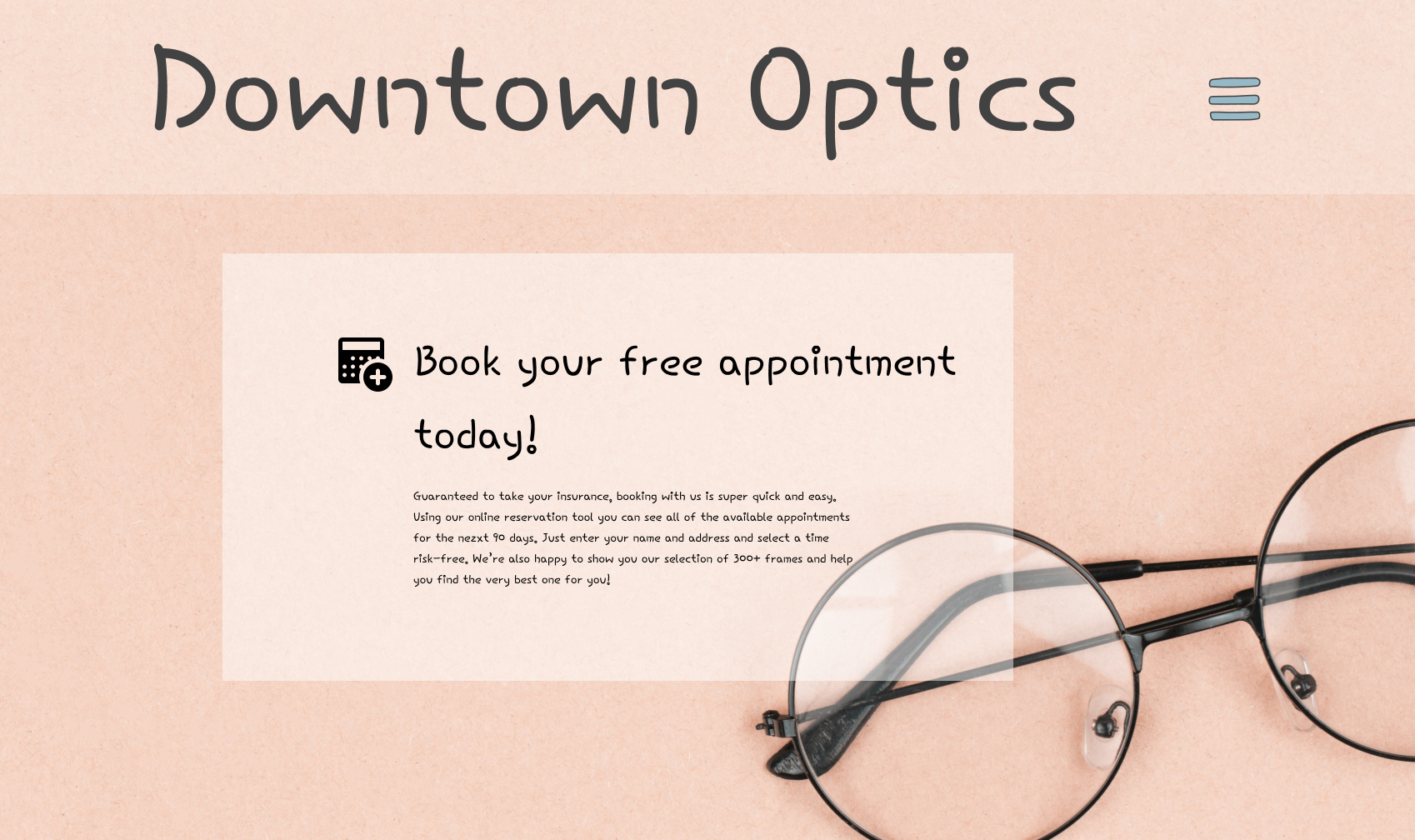
This concept company’s intention with developing a website was to get an increase in future clients, get patients to sign up for their complimentary free appointment and be able to provide their customers with a taste of their inventory. However, it was in need for a redesign
01 Base Design
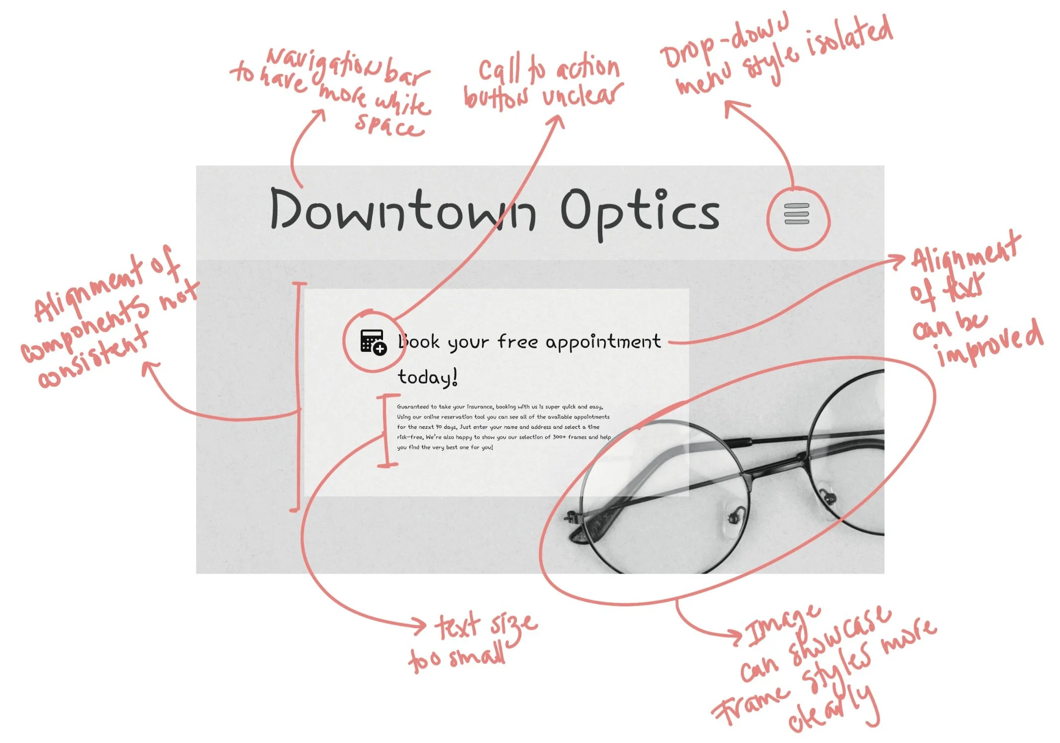
First steps was asking questions. How can this CTA button be improved? What is the desired hierarchy? What story do we want to tell the users? Through an inquisitive dialogue with the design I could hone in on the design/user’s pain points when interacting with this hero page.
02 Identifying design pain points
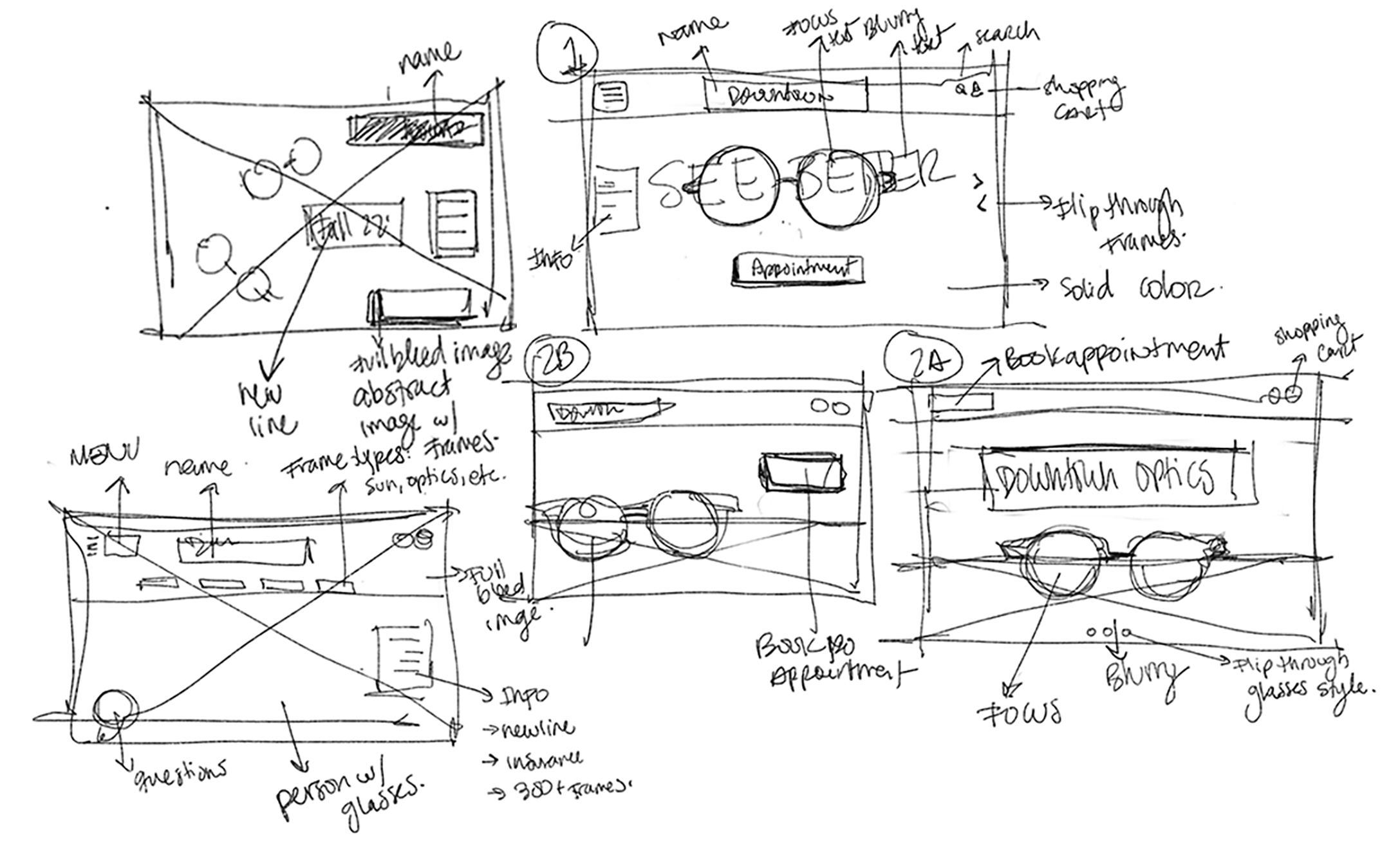
Synthesizing the pain point analysis and keeping the company’s goal in mind I began sketching and designing wireframes.
03 Wireframe Studies
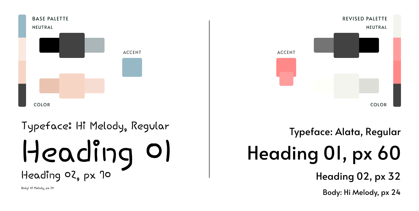
The intent was to “modernize” and brighten the aesthetic of the page and in turn allowing the style guide to serve as part of the functionality while keeping true to the base
04 Revised Style Guide
Base
Revised
05 Redesigned Hero Section
Before | After
Recognizing the information that was important in the base design, I approached the new as a refreshed version of the previous. The user is now able to see a more dynamic aspect of downtown optics. You can interact with best selling frames while ensuring that you can understand the purpose of this website. To book your appointment and help Downtown Optics help you See Better


