Mobile based Food ordering app for FIKA. A Trinidad based catering company currently operating solely through Instagram, Fika wants to expand and facilitate services for customers
FIKA
Role: UX Designer, Product Designer, Graphic Designer & Illustrator
Tools: Figma, Illustrator, Photoshop, Miro & Procreate
Fika is a Swedish word for making time to have a break. In this case a delicious, genuine, home grown business catering to those who live in north Trinidad
Fika was started as I wanted a way for owner, Jared Mohammed, to continue cooking during Covid. “What makes fika unique is that we try to cook everything from the ground up so we make everything from all of our doughs, mayos, ketchups etc.”
Fika is a melting pot of flavors that provides you with meals by the day or a private event.
Who is FIKA?
Problem Statement
Fika currently operates through Instagram and a third party delivery company. With increasing orders and customer growth, this causes the business to have strenuous additional operational and management tasks as well as a divided customer experience
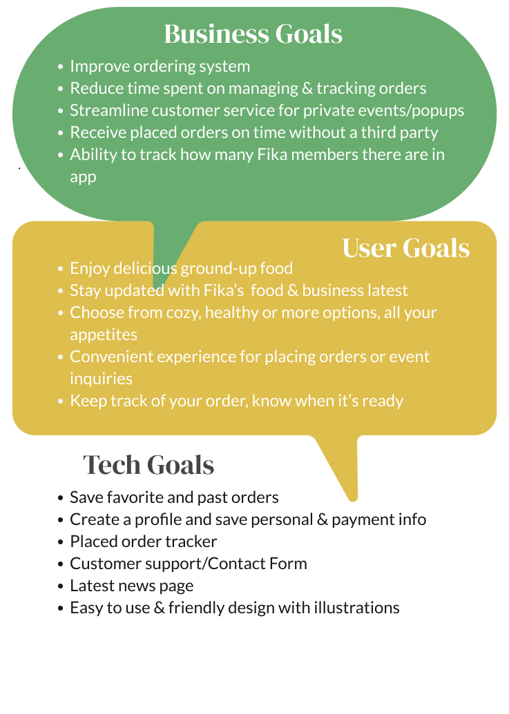
I started off the project by collaborating alongside Fika’s ownership to define scope, goals and timeline. Establishing the primary groups of focus to target and guide the development of the design.
Defining and Managing Goals
Initial discussions helped structure a research plan. Determining methodologies to further understand how users relate to Fika and other food ordering/delivery services in Trinidad.
Preliminary Research Plan
How do users interact with existing web/mobile food ordering in Trinidad
Understand Fika’s new and recurring customer challenges & motivators
Understand Fika’s presence with users
How to streamline ordering and tracking of food orders
Through a series of virtual one-on-one user interviews and an in person focus group session, I could further understand where Fika stands with users as well as how online food ordering is used and perceived in Trinidad.
Speaking with Users
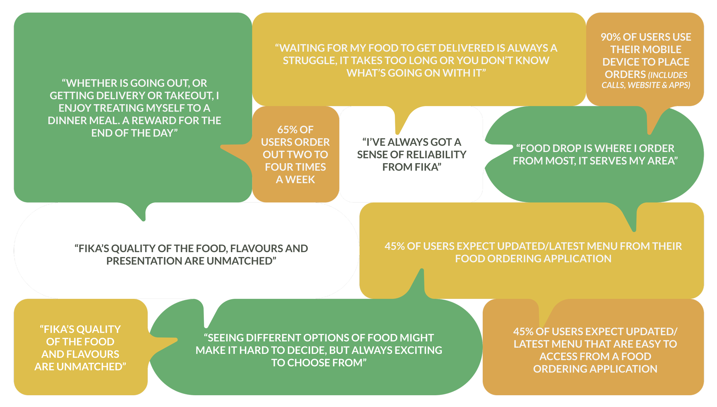
I started to be able to empathize with the user and sort through each data point in major themes.
User Research Findings
“Any business app is a resourceful development to see in customer service in Trinidad”
“I enjoy being able to have a variety of options that are easily accesible”
“Long wait times for delivery or not knowing when my order is ready is too common”
“I enjoy ordering food to ease my day or as a reward after a long week or day”
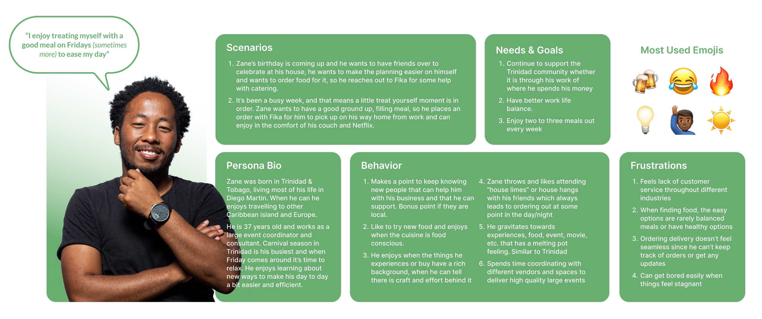
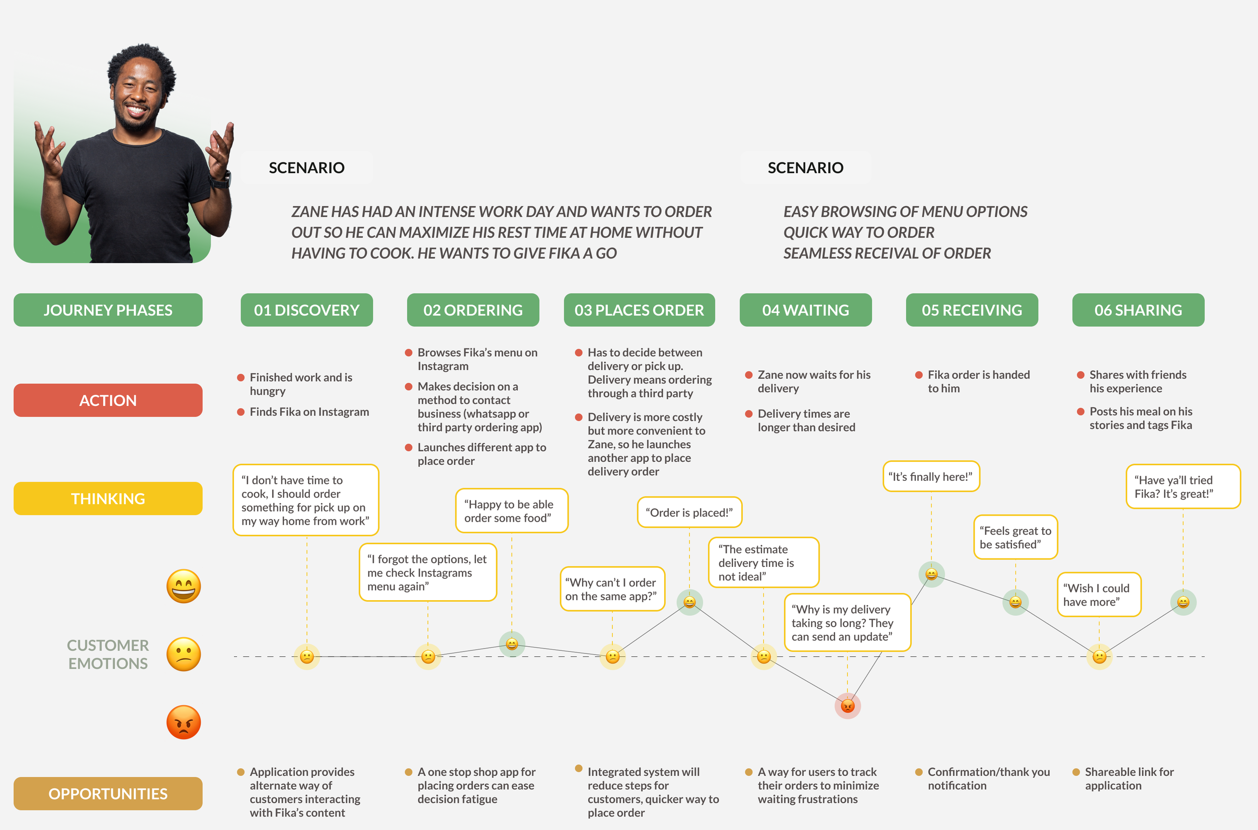
Based on the research findings we can introduce Zane! The primary data based persona. He serves as the user archetype and base reference point as the design and values of the application are further developed.
Hi Zane!
Diving deeper into our persona’s purchasing behaviors, the journey map delineates the timeline of how customers currently place an order with Fika
Journey Mapping
Insights
From the journey map development the followings are the primary insights derived
What were the challenges?
Users lose drive as they have to use multiple application to place an order
Having the menu split from where you order leads users to go back and forth
Lack of information during a standard long delivery time causes frustration
What was enjoyed?
Options provided by Fika are unique and exciting
Ability to have the option for delivery vs pick-up is flexible for users
Having access to their Instagram account creates user engagement
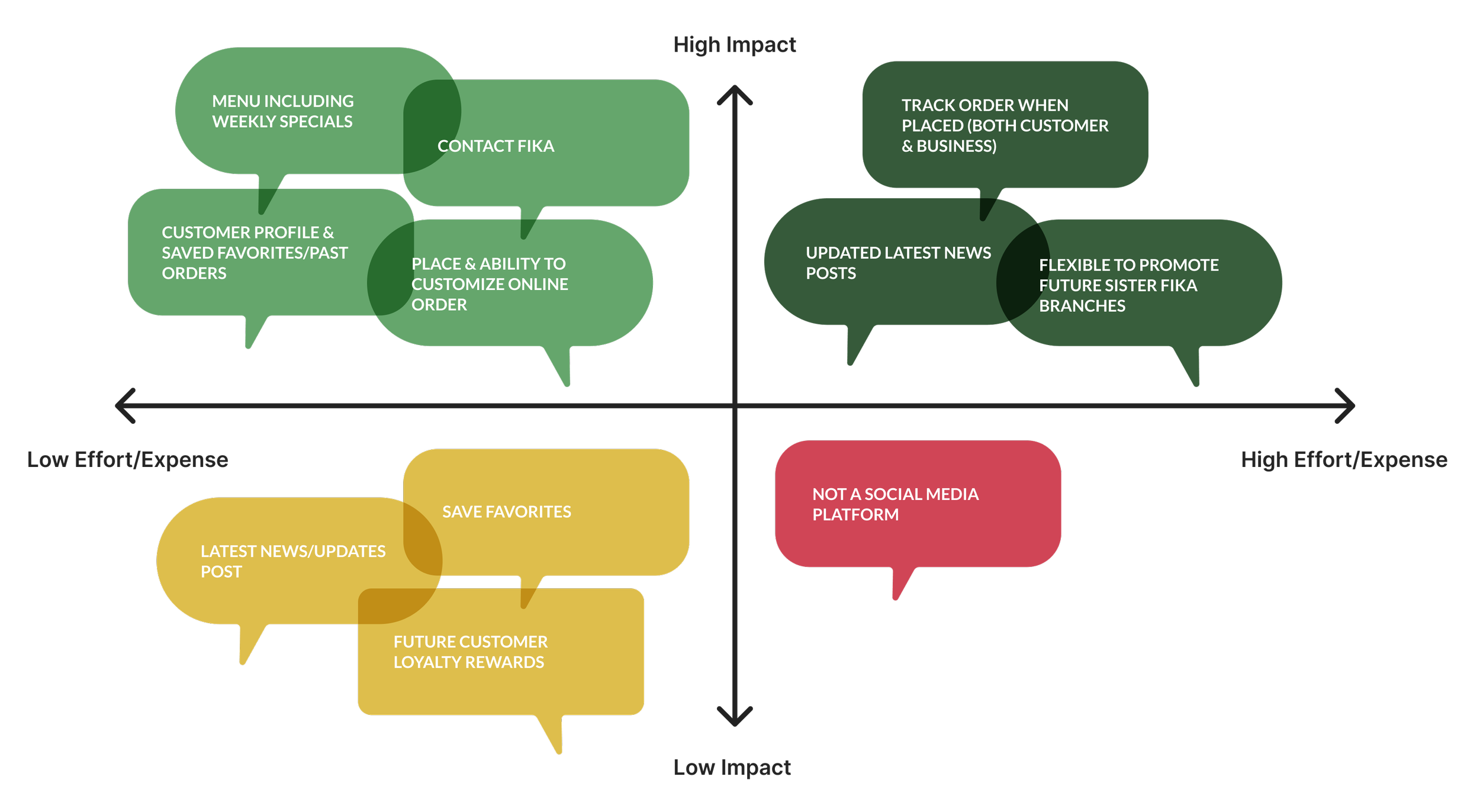
Considering Zane’s needs and goals alongside overall user and ownership expectations, I collaborated with Fika’s teams to establish a hierarchy of features to be developed and not.
Staying away from having a social element to it, Fika remained aligned with providing a ordering service that would ease process and management for both users and stakeholders.
Feature Prioritization
So what does a task using these features look like? How does Zane use the application? A preliminary task analysis helped shape usability.
Task Analysis
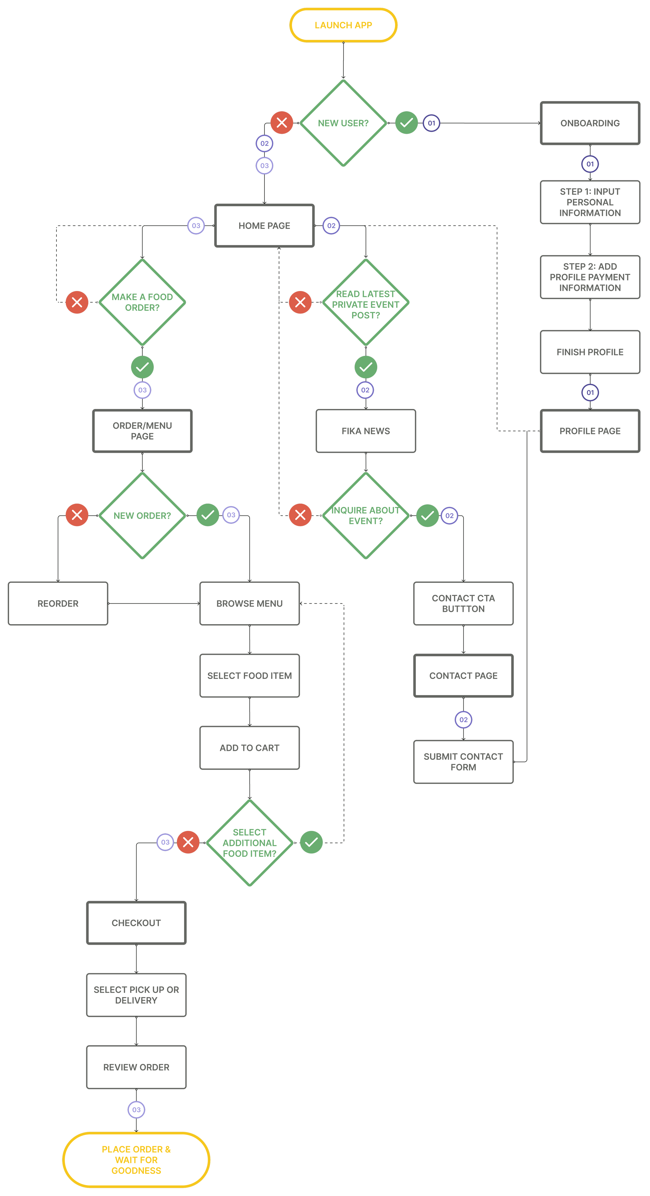
User Flows
Then I defined an in depth user flow sequence that mapped out three scenarios for Zane:
Scenario 01: Zane saw Fika’s Instagram's post about their app launch, he downloads the app and launches it for the first time. He creates his account to make the new ordering system even smoother.
Scenario 02: Alongside his sibling, Zane wanted to plan a nice get together at his house for their parents anniversary with their closest friends. He sees Fika’s latest private event story on the App and proceed to inquire about having them cater his own.
Scenario 03: Zane had a site meeting in the morning and wants to place a lunch order for pick up to grab on his way back to the office. After all, it is Friday.
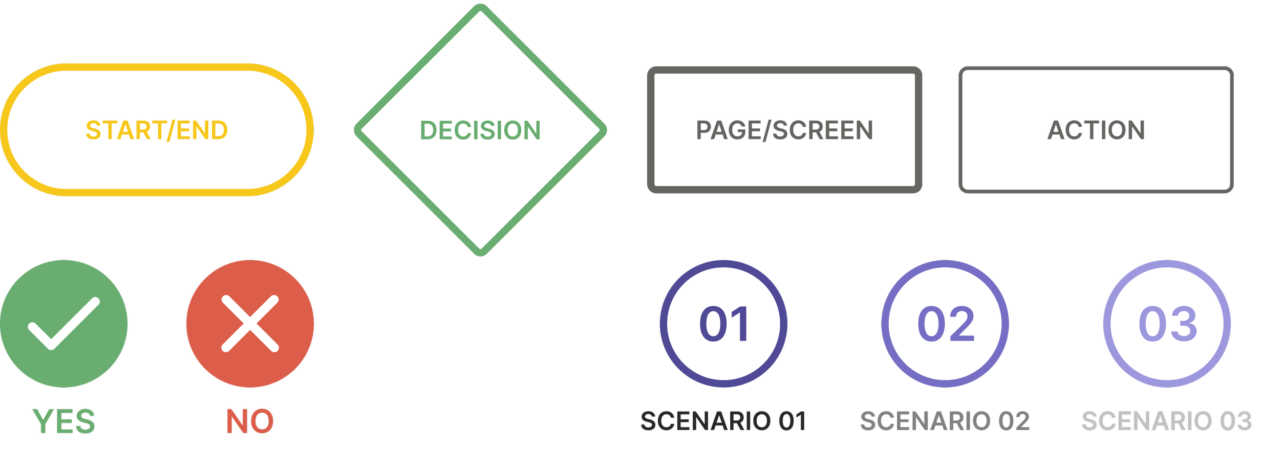
Legend
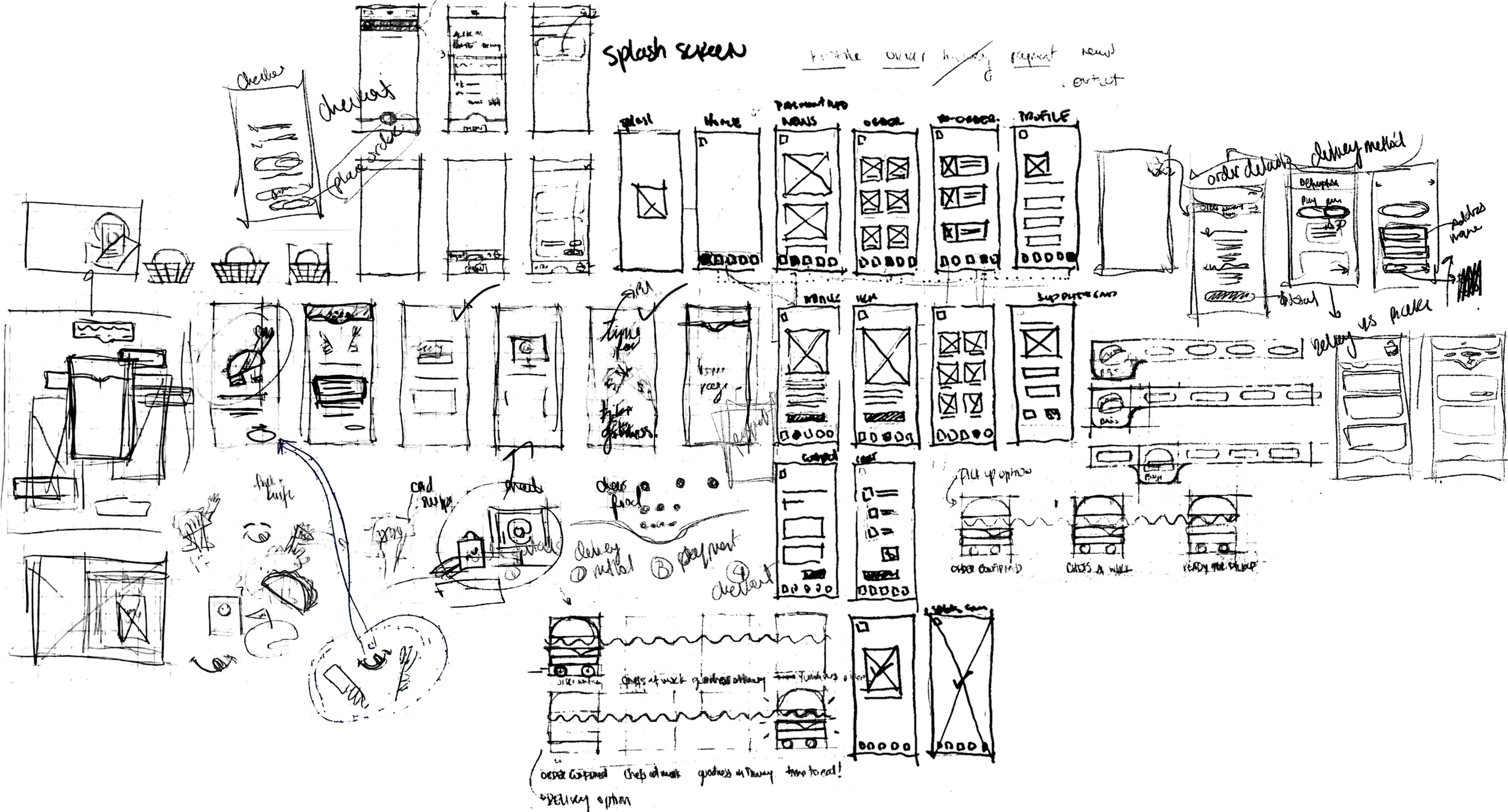
How can we provide an interactive friendly experience for Zane? Sketching through ideas and brainstorming how to do so was the following step to creating an informed design.
Pen to Paper
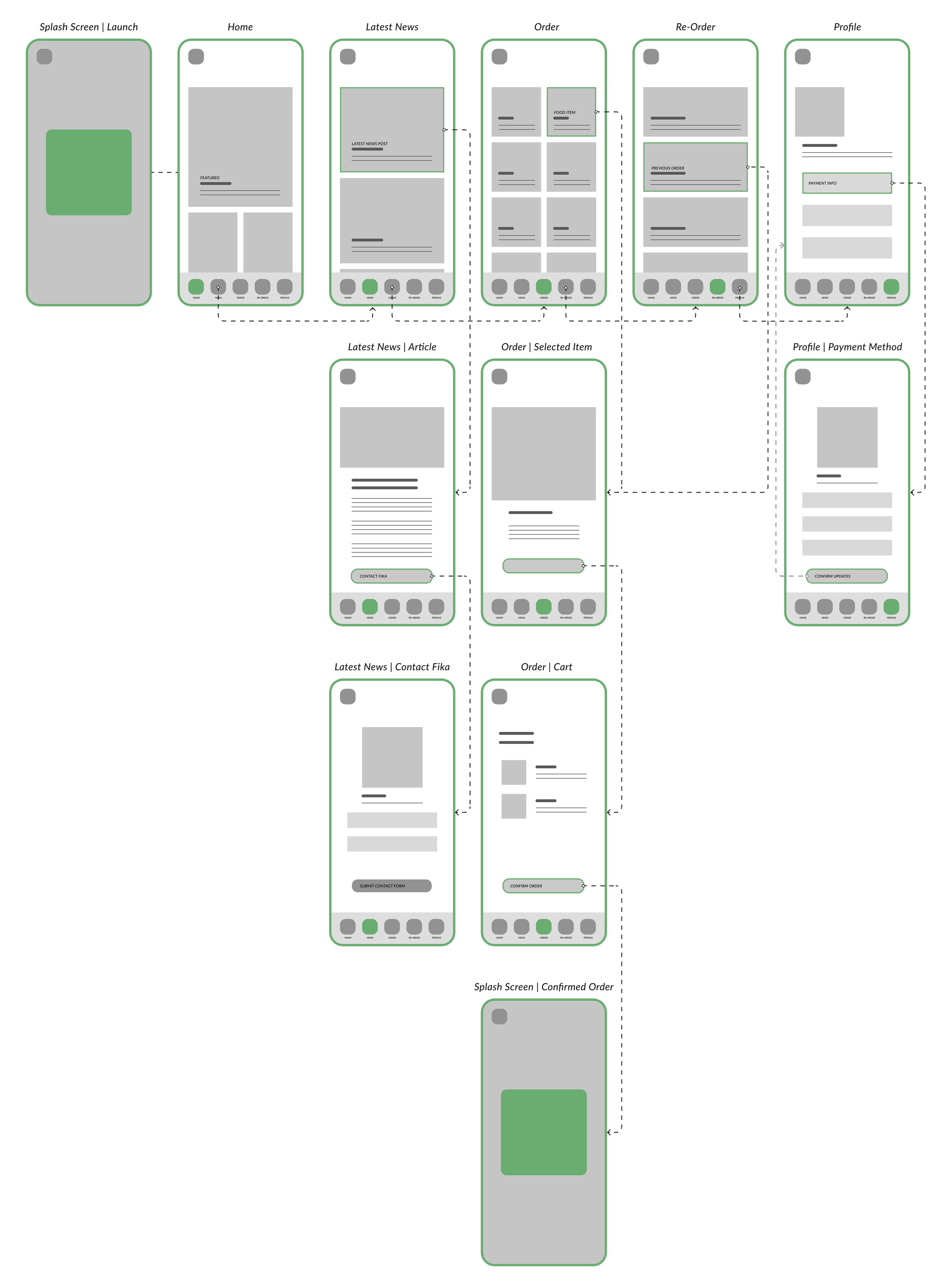
Establishing the primary elements to be placed on the navigation bar early on helped set the structure of the application. This was derived through continuous communication with Fika’s teams ensuring that their concerns also aligned with user’s needs. In this iteration we focused on the sequence of placing an order.
Low Fidelity Wireframes
I used the low fidelity wireframes to conduct a series of one-on-one virtual preliminary usability tests. By doing so, data was gathered from users that served as valuable early stage feedback and insights.
Usability Testing & Insights
What were the challenges?
Difficulty telling food items apart , menu categories would be helpful
Where do my selected food items go? I don’t see my cart
No easy direct way to access contact page
What was enjoyed?
Refreshing and new development of customer service in Trinidad
Having images represent the food items help me make decisions
Simple design is easy to interact with
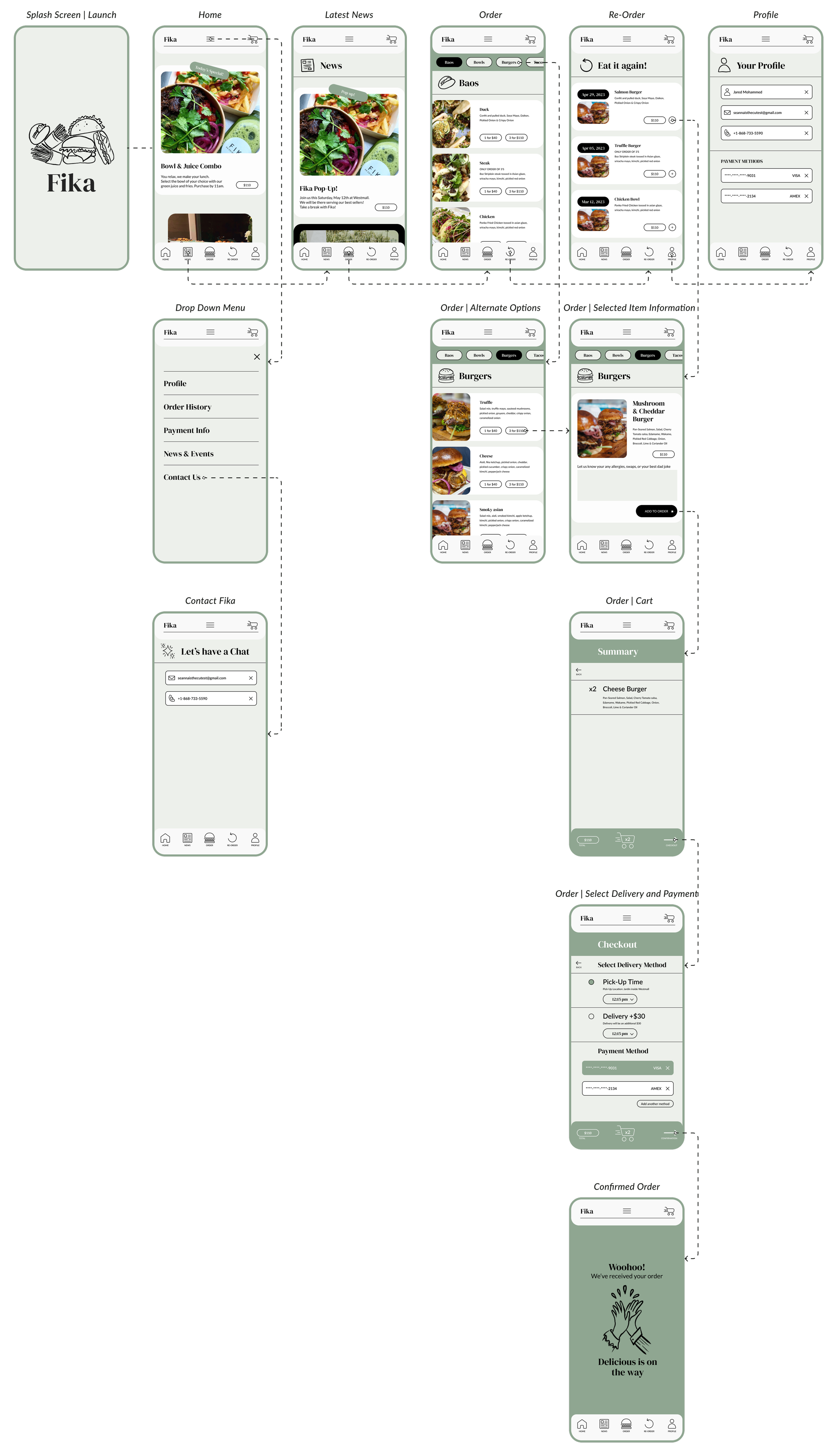
This next phase of wireframing takes into consideration the insights acquired from the usability test data. For example, showcasing menu categories and including images for each food item available. While adhering to a “clean” design, these preliminary screens begin to also incorporate illustrative elements.
High Fidelity
Insights
Once again taking the design to it’s users, I lead another round of seven one-on-one virtual usability tests. Two of which were part of the previous, key insights are the ones highlighted here.
What were the challenges?
Adding multiples of one item is difficult
Knowing where to start placing order could be more clear & can I track my order?
Fika has a great Instagram presence, I want to be able to access through this app
What was enjoyed?
Design feels friends, not a daunting way to place orders with Fika.
Enjoy being able to have a re-ordering option
Ability to see private event news and Fika pop ups is exciting
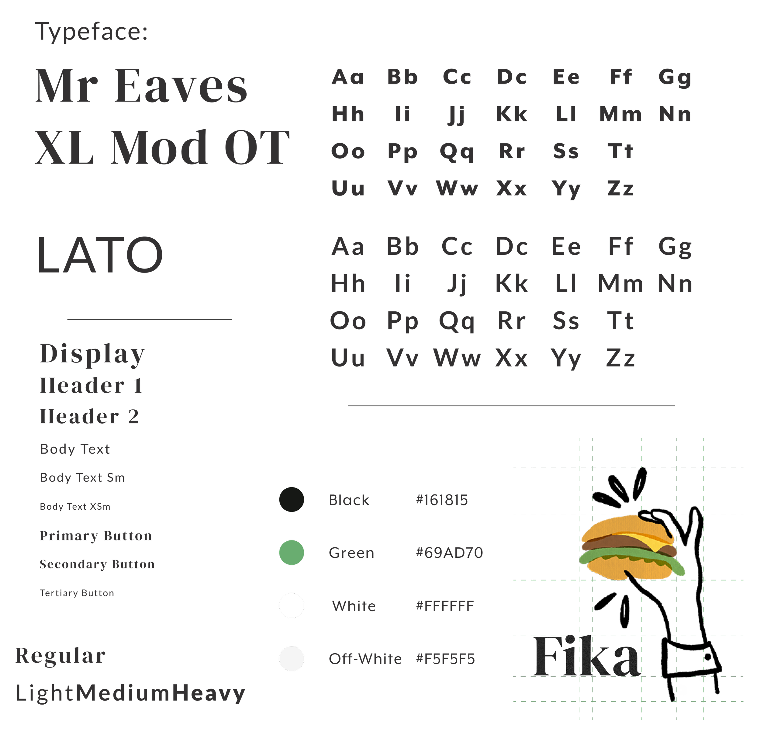
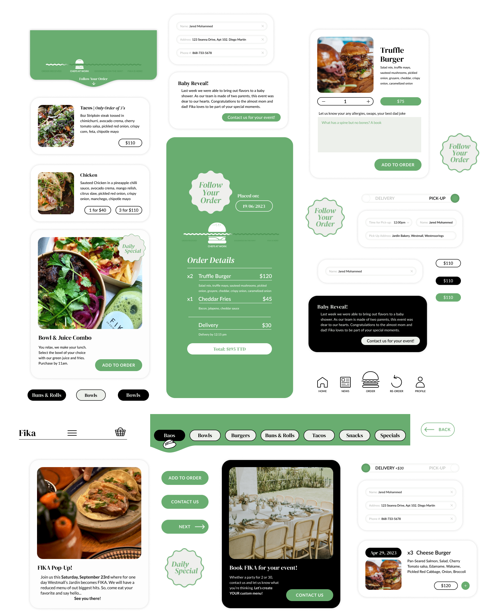
Throughout the process Fika’s style guide was underworks. It needed to reflect the existing brand, yet ownership was flexible with typeface and color choices.
UI Kit
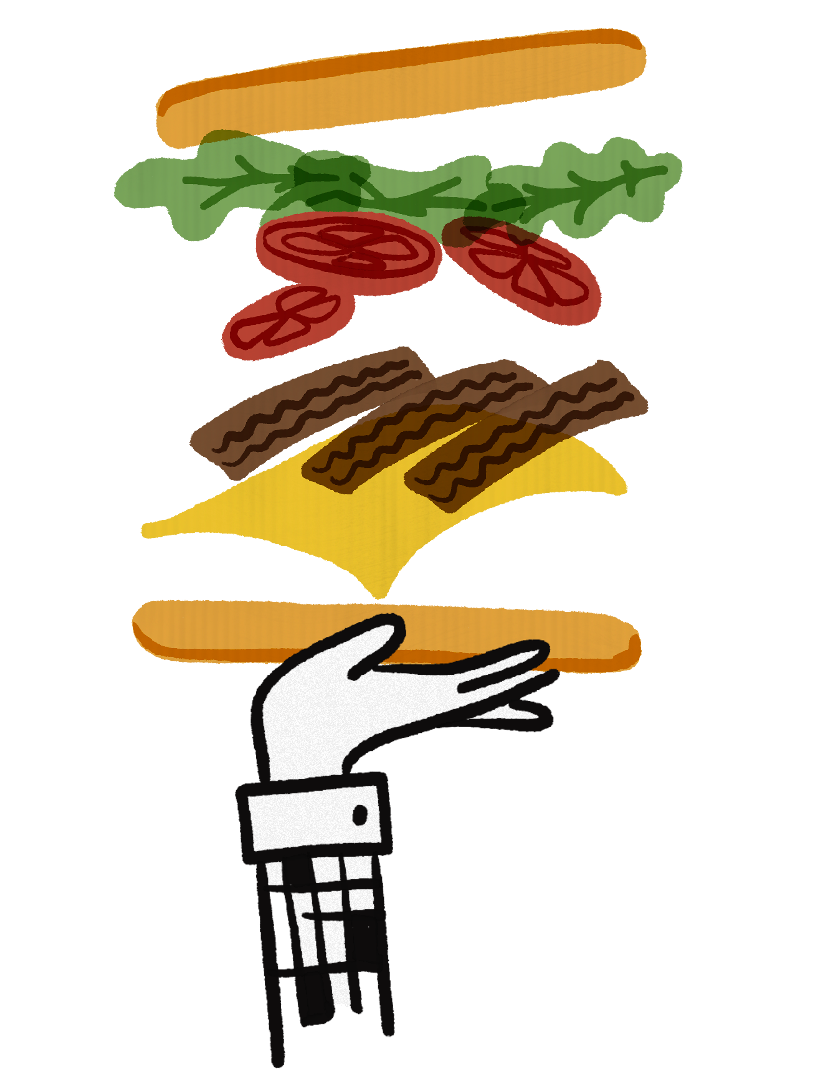
Peppering illustration elements throughout the design while keeping a professionals style was emphasized by ownership. I created the illustrations to act as a companion to the information. The use of illustration also help the design embody Fika’s approachable demeanor to users.
Illustrations
As the overall screen iterations progressed so did the puzzle pieces or ingredients to the bigger recipe. This latest approach becoming an essential part of the UI kit
Components
Happy Customer
Happy Fika
This latest design of Fika’s one stop shop app is a result of collaboration with Fika’s ownership. The design builds upon the insights gathered from research and usability tests which helped refine the design. The app caters to the needs of users and allows Fika’s team to spend less time managing growing number of orders.
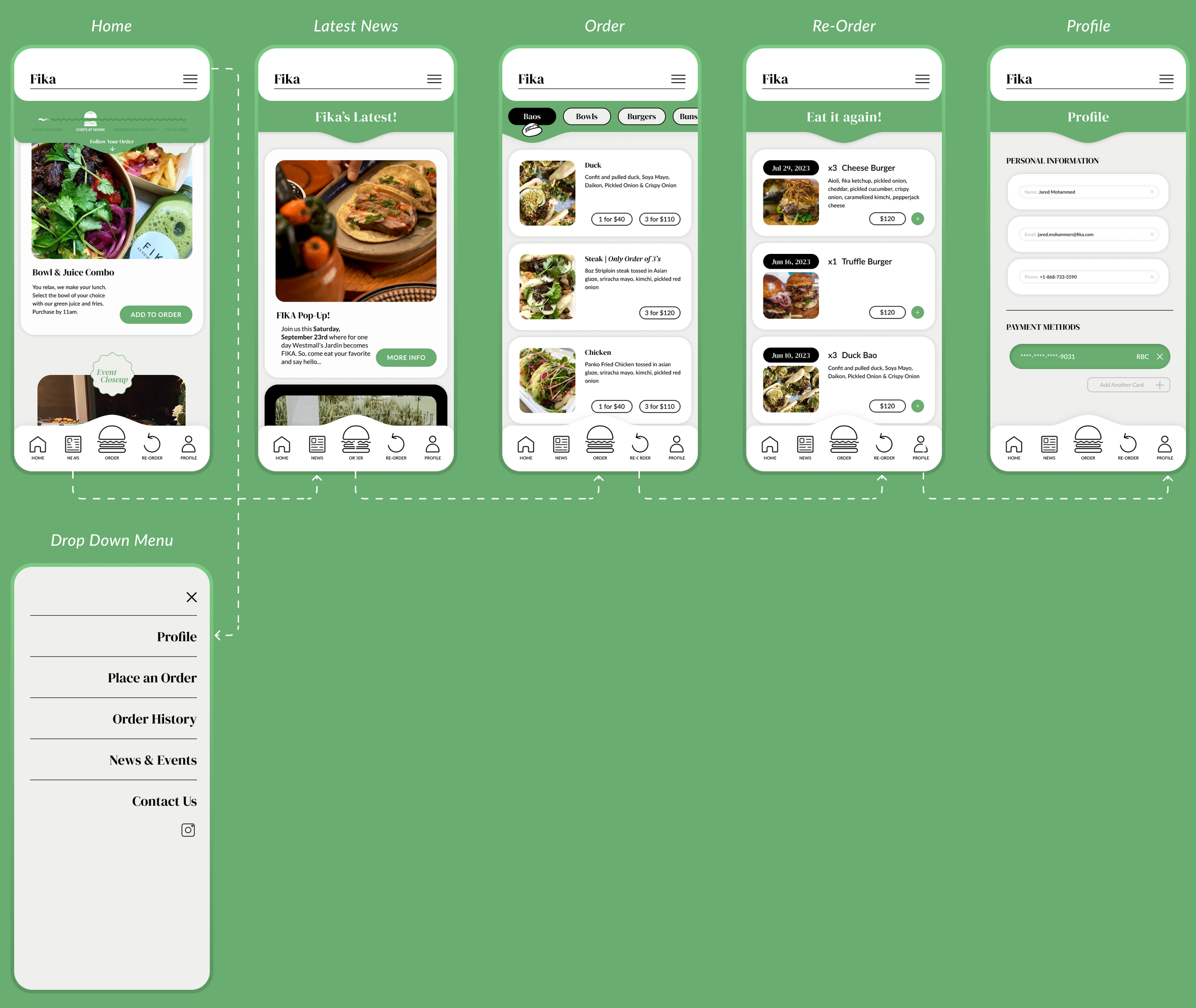
Navigation Bar Tour
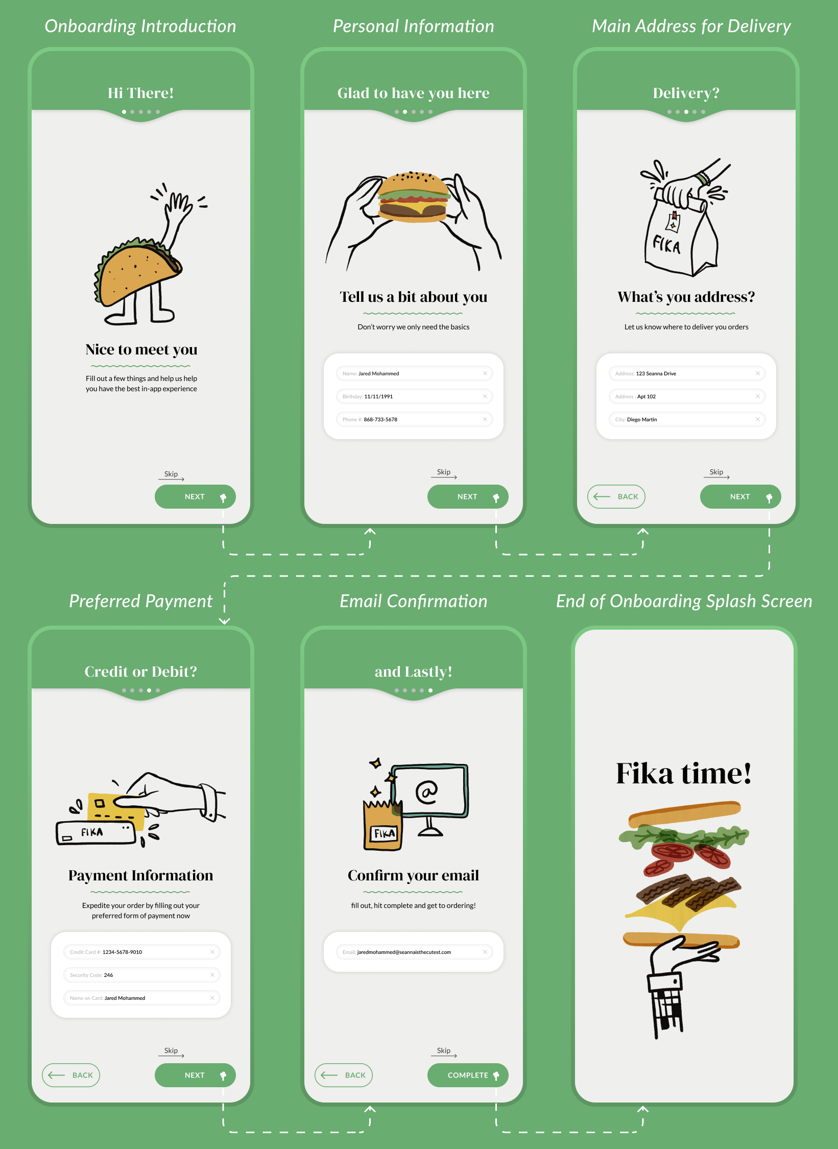
As a new user, your first exchange with the mobile application is an onboarding journey. Where you can share information about yourself in order to make your in-app experience even smoother.
Onboarding
The navigation bar components were established early on and remained. Merging data insights with ownerships wants the icons shown represent the information with easiest access and importance, of course centering ordering as the primary CTA button.
Navigation Bar
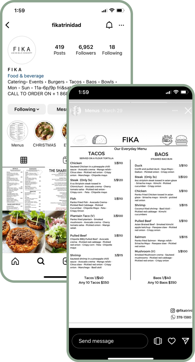
Currently Fika’s menu is showcased through an Instagram post, where users have to remember what they want and launch a separate app in order to begin placing an order
With the new app, users have an interactive experience of Fika’s menu. Each item with an image to aid with decision fatigue and you can add items to your cart right then and there.
Browse Fika’s Menu
Existing Menu Display/Access
New Fika In-App Menu
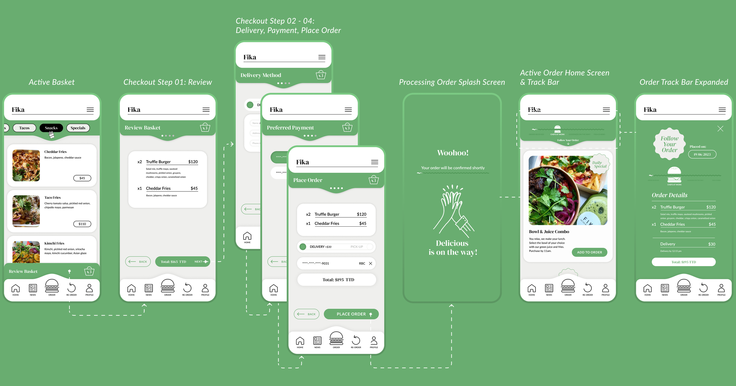
The largest update being delivered through the design is the ability for users to track their orders. The delivery times may be long throughout Trinidad, however giving users timely order status information gives the users more ownership of their placed orders.
Place and Track Your Order
Checkout User Journey
Add to Cart & Checkout
Trinidad has loads of room in their market for businesses to roll out new features that reshape their efficiencies and provide an improved customer service experience.
Collaborating with Fika through the process was key in the development of the design. Using the user data and marrying it with ownership’s desires lead the design into an extension of Fika.
Currently the app is set to launch in the second half of 2024 and we are trying to understand together how we can collaborate with other growing applications in Trinidad to have a seamless experience. Overall giving Fika an app that let’s them spend more time on creating wonder meals.
