What if we had a new clothing E- Commerce brand for young professionals? Perhaps called Modura?
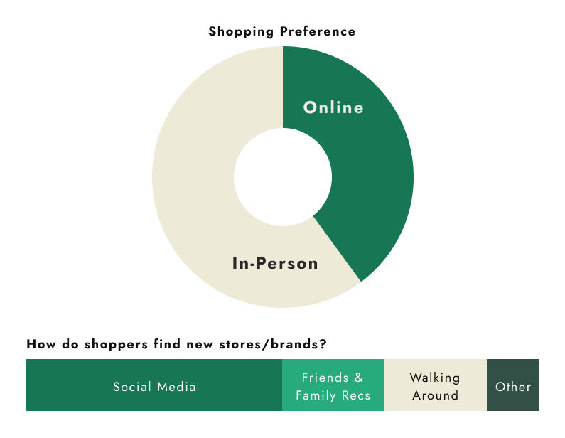
What better place to start than engaging real life shoppers. Focusing on 18-30 years old who live in urban areas, I lead user interviews to hear about what these future Modura shoppers like, dislike, and hope for in their shopping experience. From the 16 people who participated 60% preferred in store shopping. Why? How can we improve their online shopping experience?
Hearing from online shoppers
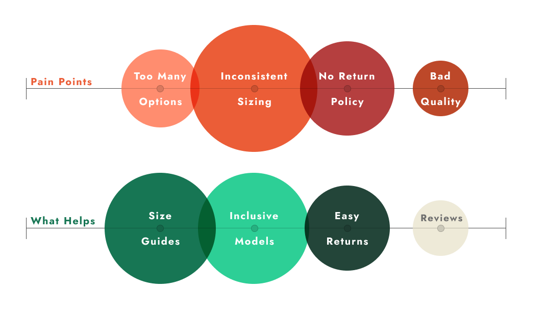
Though online shopping wins in convenience, sizing and quality inconsistencies creates doubt and indicisiveness for shoppers. However, when provided with the right information, for example inclusivity by showing clothes modeled on different body types or a clear size guide, the shoppers feel more at ease making a purchase. A good return policy is also a consistent desire for shoppers especially when it comes to trying a new store.
What did we learn from shoppers?
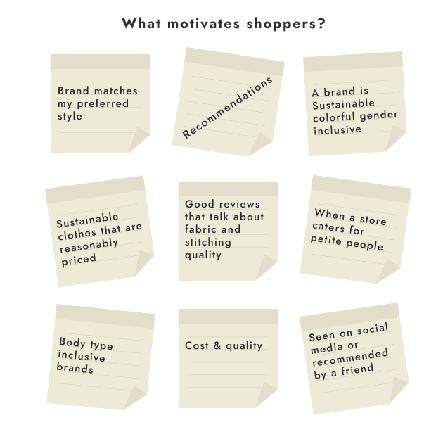
Through research we can derive what the ideal e-commerce brand embodies, what brand values create Modura
What is Modura about?
Inclusive
18-30 years old
Convenient
High-quality
Classic Staples
Comfort
Easy returns
Affordable
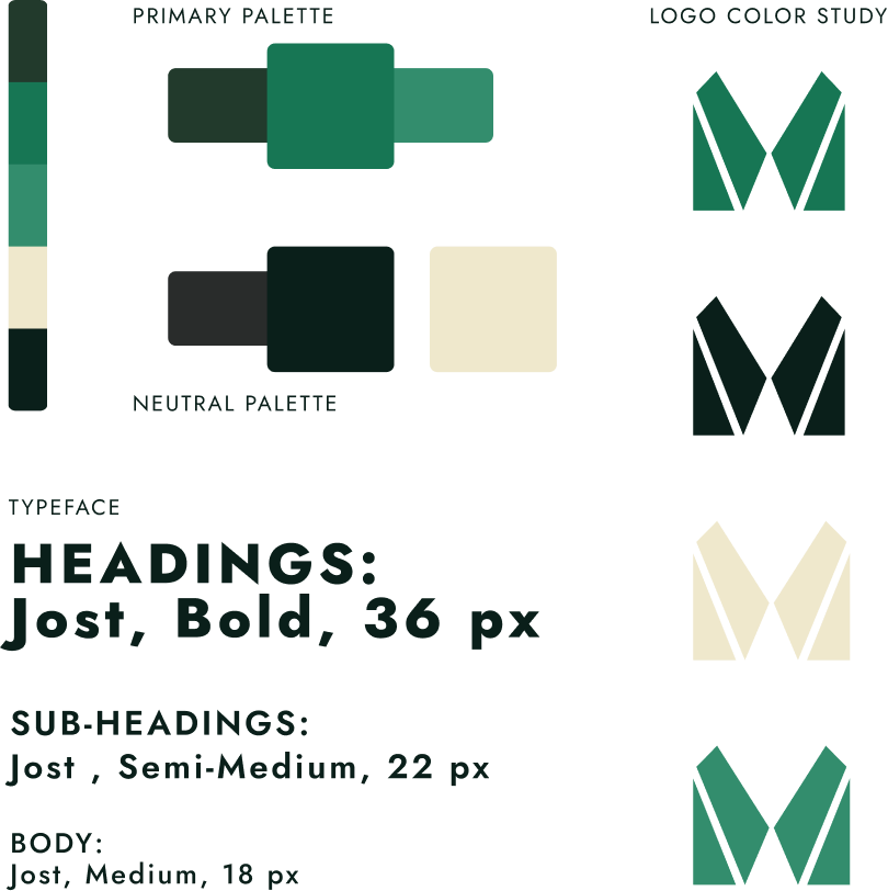
Creating a logo was the initial graphic pencil to paper phase. It is a design element that should be scalable and adds recognition to a brand. The button down shirt, a piece of clothing that is so widely used by all, is gender neutral and versatile, served as the inspiration for the logo. Abstracting a familiar piece into Modura's new stamp.
Giving modura a face
The style guide takes into consideration the user's preferences on inclusivity and flexibility. As a woman, there have been countless times where you go and buy a simple product that is then up-charged because it has been painted pink or purple. In this case we avoided this through the conscious color palette decisions
Style Guide
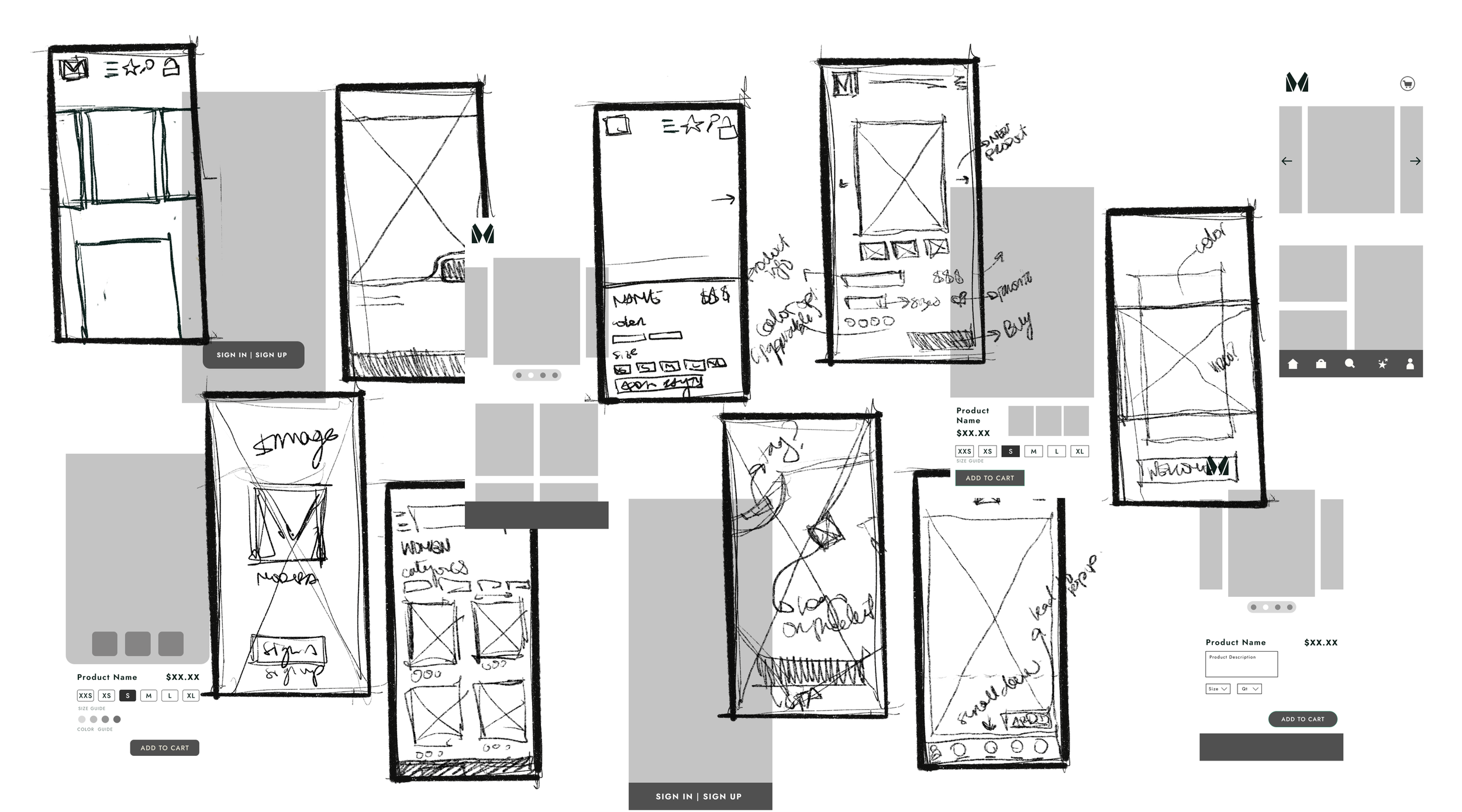
A drawing board of wireframes
Once again putting pen to paper (apple pencil to IPad*) and used the data combined with the previous design decisions to begin creating low & high-fidelity wireframes. Through this still asking, how can we reduce the stressful moments when online-shopping while presenting a new brand?
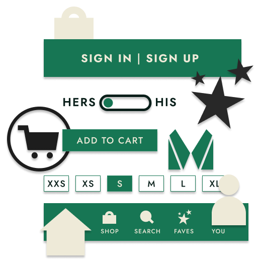
Through iterative wireframe studies, there were elements that remained consistent throughout the screens, this of course meaning components were in order. These served to convey important CTA buttons as well as visual cues that allows the user to have confidence in where to go next in their journey to their brand new clothes.
Component consistency
Your new favorite wear anywhere clothing brand.
Designed for trendy humans between 18 and 30 years old. Modura is for people that are looking for an affordable solution for business casual clothing that they can dress up, down, mix and feel good in.
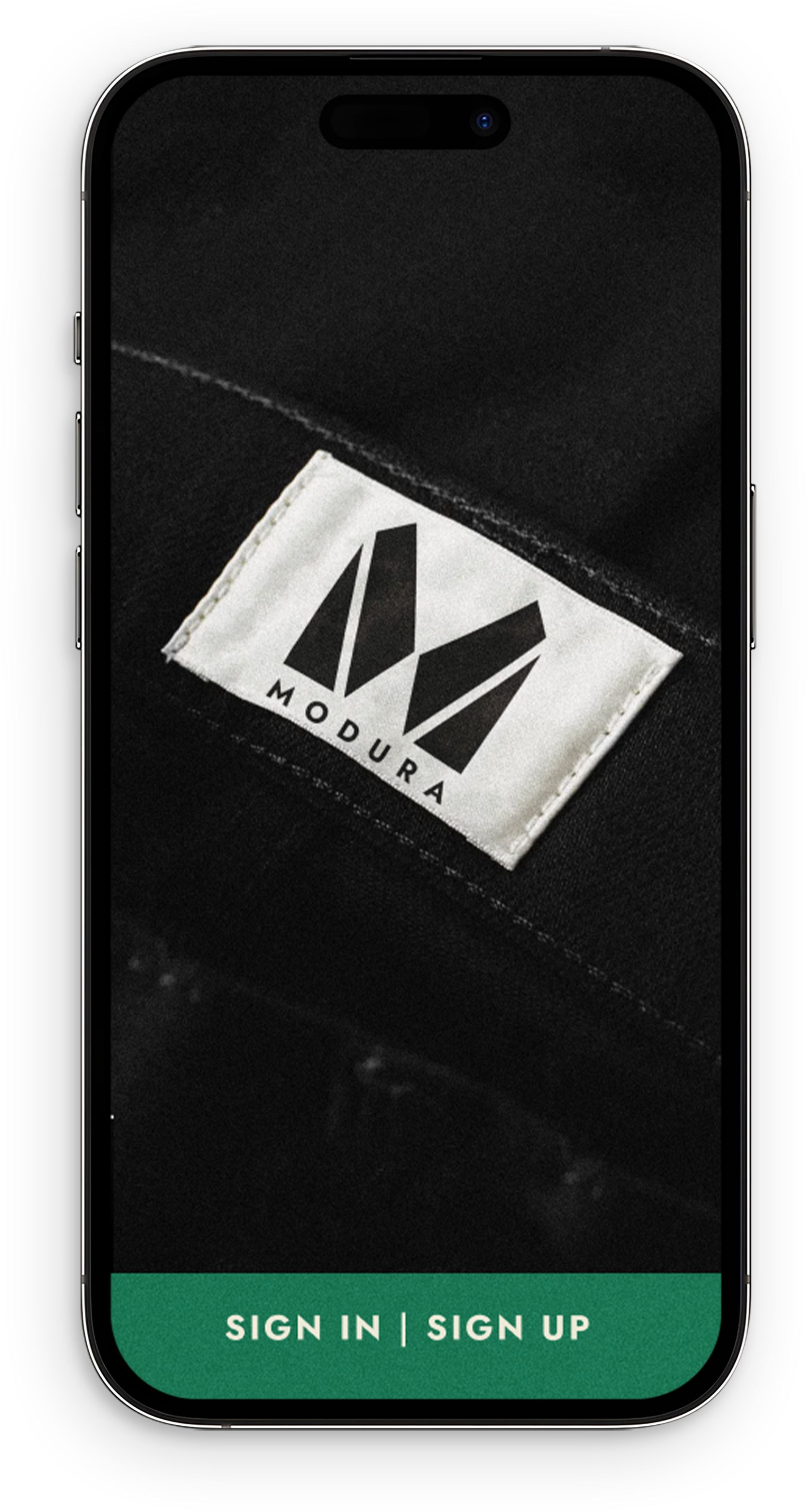
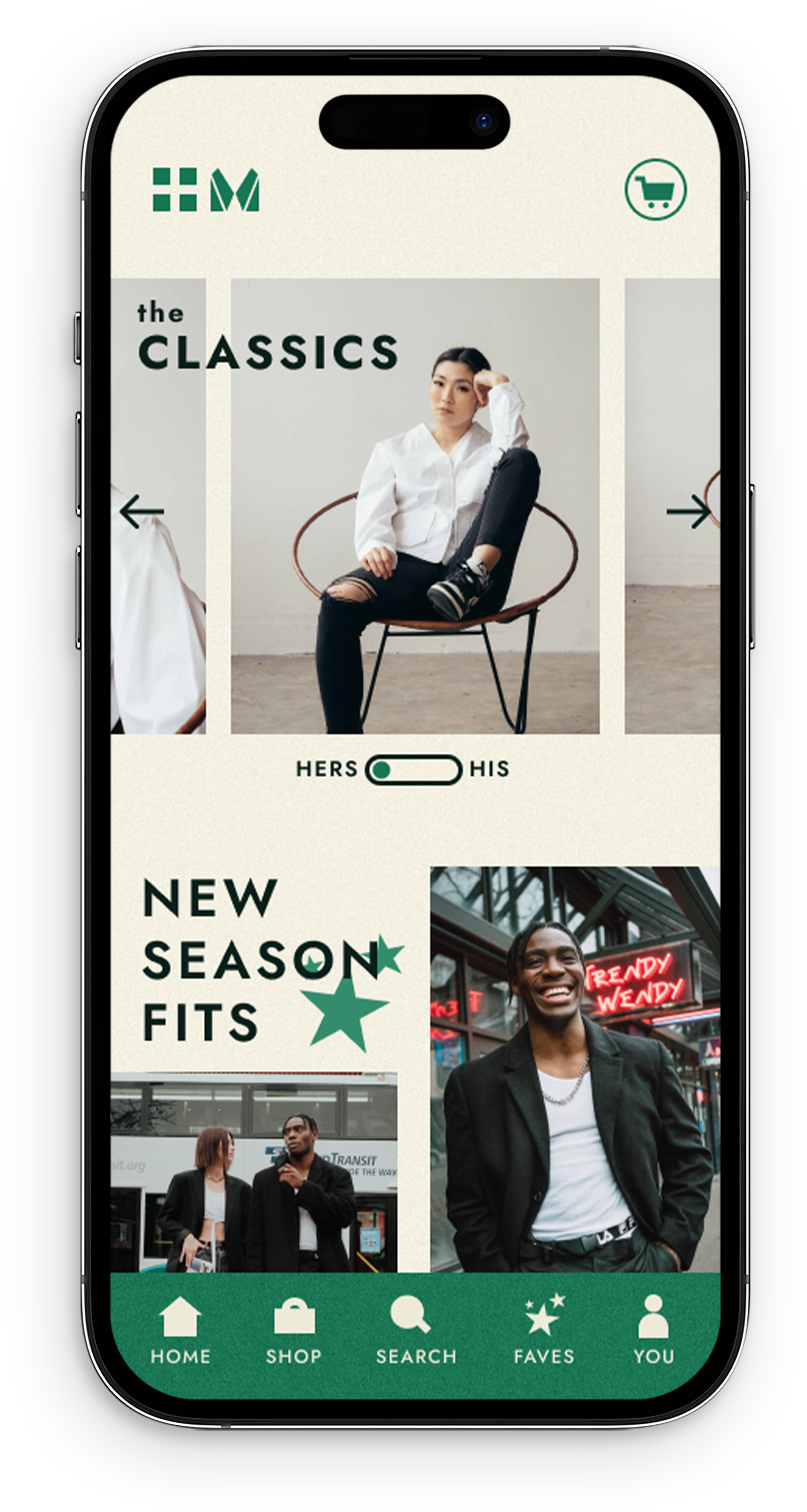
The features of these three screens are the latest high-fidelity example of what Modura can offer as a new brand on the block. Staying with classic neutral colors for both UI and clothing, Modura’s green throughout the app is the attention grabber while representing growth, harmony and stability.
Modura in High-Fidelity
Sizing inconsistencies and lack of representation were the primary concern of shoppers. Modura’s design ensures to include models all shapes and sizes and letting the users know what size models are wearing. It includes a wide range of sizes as well as providing a link to a size guide.
