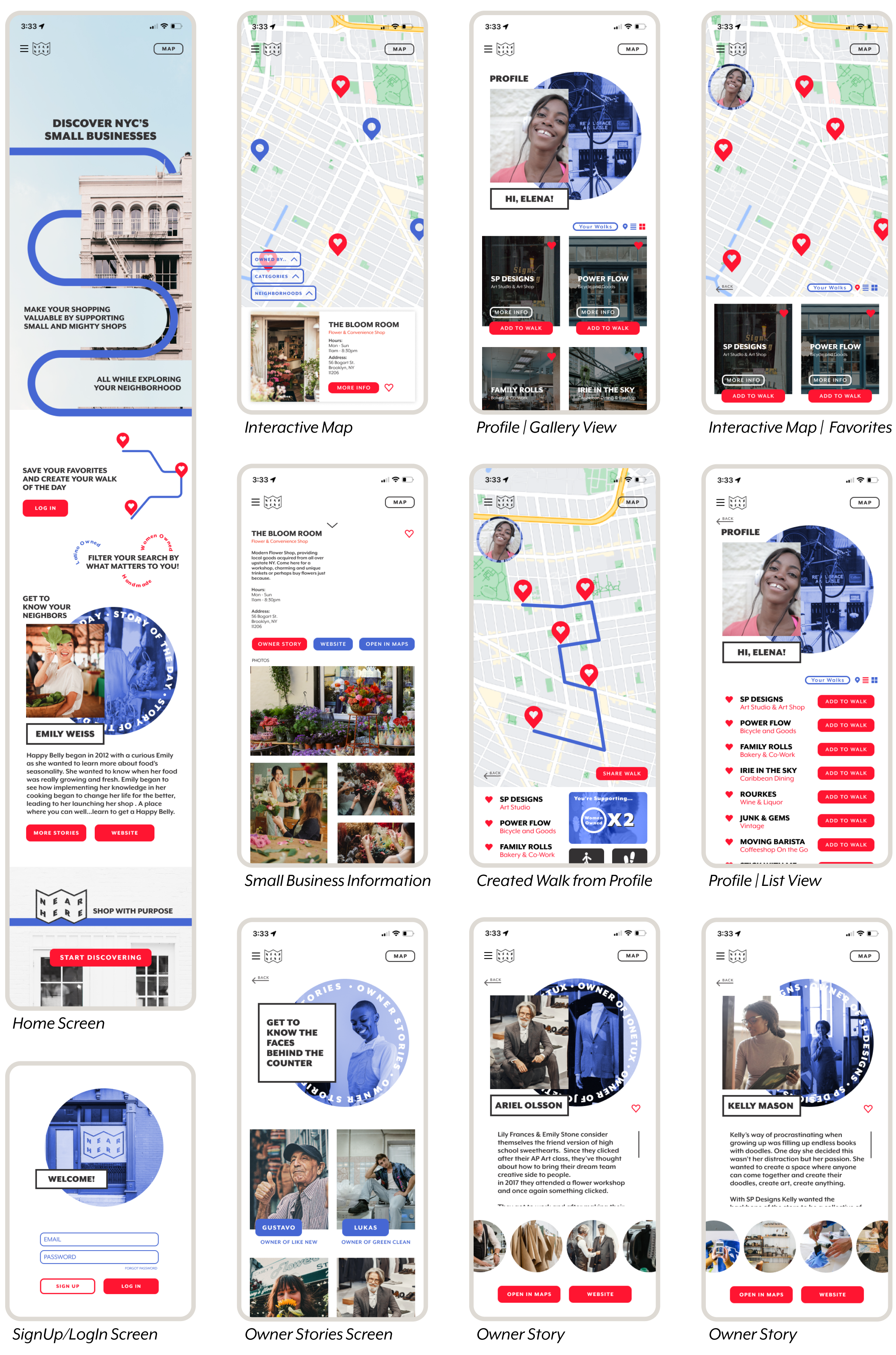
Mobile app concept design for Near Here. A case study that adds meaning to how you get to know New York City as you support small businesses. Shop local and get to know your neighbors.
Near Here
Role: UX Designer, Researcher & Graphic Designer
Tools: Figma, Illustrator, Photoshop, Miro & Procreate
First, I started by defining a research plan. This included thinking through goals, who to include in the conversation and learn from, existing conditions, and methodologies. What are my primary questions? What do I need to understand further?
Adding Structure to Curiousity
Understand the important of supporting small businesses are to NYC residents
Understand person’s needs and desires when going shopping
How does a user get to know their neighborhood?
Understand challenges or advantages of in person vs. online shopping
Exploring and finding a new shop to support in New York City can be daunting and there is a rise in the desire to shop local. Yet, users aren’t able to easily find a resource that outlines small businesses in New York City leading them to continue to support big box brands
Problem Statement
Through a series of virtual one-on-one user interviews paired with competitive analysis , I was able to acquire qualitative and emotional insight into the user’s journeys.
Speaking to Users
Using an analysis affinity map I categorized each data point and began to see clear themes. I started to be able to empathize with the user’s pain points and hopeful solutions in their shopping and neighborhood exploring journeys. How can these two subjects successfully intersect?
Drawing on the key ideas and themes I was able to synthesize the findings. For example: A high percentage of users research an item before purchasing which was tied to getting an appropriate price point, but it was also a way to confirm the authenticity of a product, what is the story behind the product or the brand?
Users felt rewarded when a purchase was made in support of a bigger story and enjoy shopping when it’s tied to a casual day. This takes pressure off spending while it becomes part of an experience and away from big box brands.
User Research Findings
“Im eager to shop for a brand or store that provides an experience or a story”
“I’m overwhelmed with options. I’d enjoy having a focused resource for local businesses”
“Shopping is less stressfull when it’s away from big box brands and tied to a casual day”
“I enjoy casual walks in my neighborhood and visiting old and new local spots”
Based on the research findings we can introduce Naomi! The primary data based persona. She serves as the user archetype and base reference point as the design and values of the application are further developed.
Hi Naomi!
How might we provide an information resource for shoppers to further discover their neighborhood and support small businesses?
Understanding Naomi’s needs, I began to establish objectives to what design approaches can aid in designing an application that responds to the problem statement. What is truly important in the design and what is not.
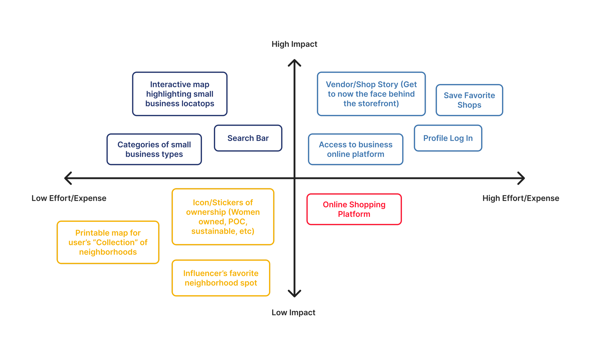
For example, Near Here is not an online shopping platform. Rather, it is an information resource for local small businesses, not only for the shop but for businesses owners. Adding a face to the shop you can get to know. It can also include gamification elements like, rewards for buying local or perhaps creating your favorite walk.
Feature Prioritization
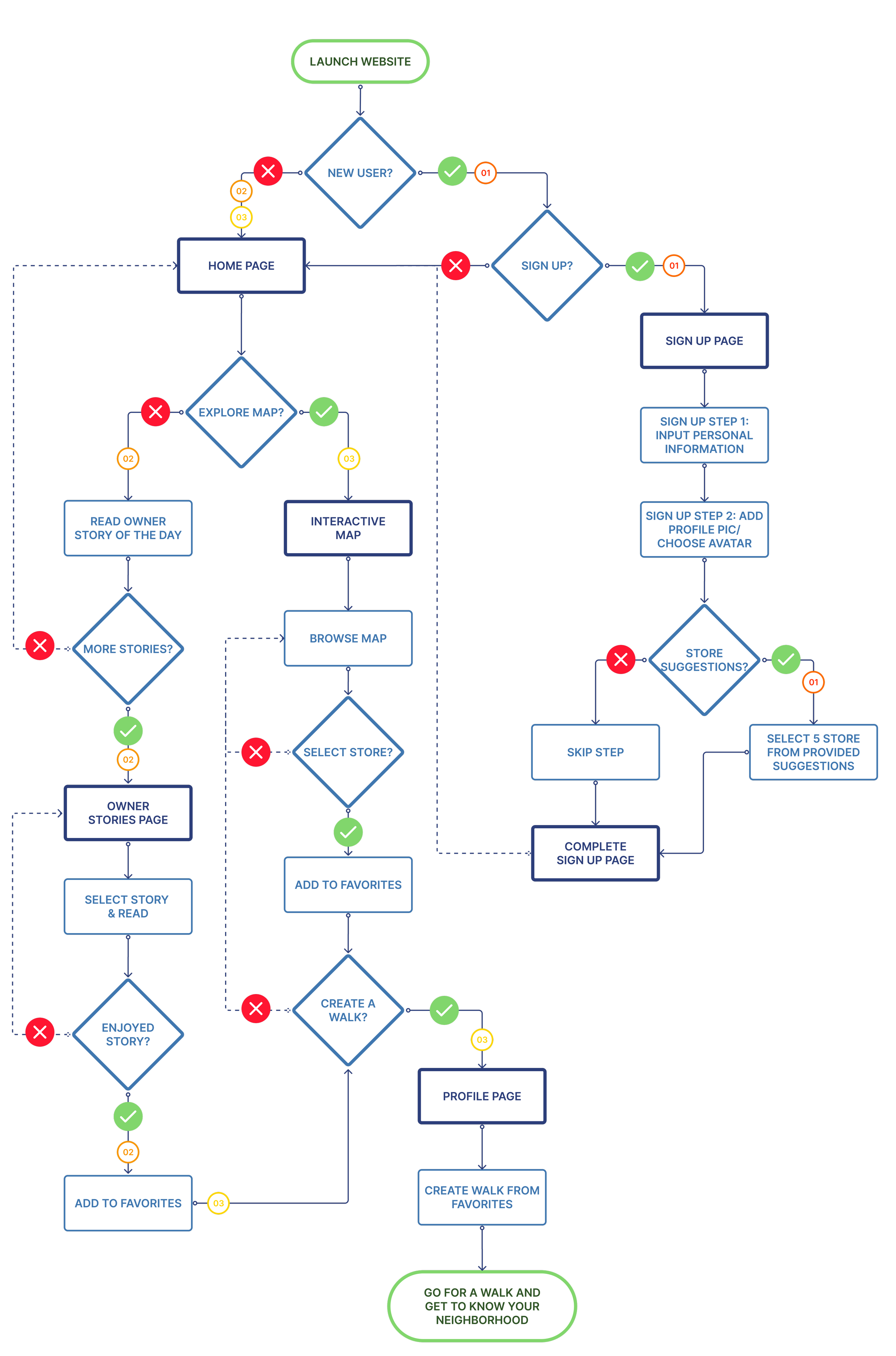
Then I defined an in depth user flow sequence that mapped out three scenarios for Elena:
User Flows
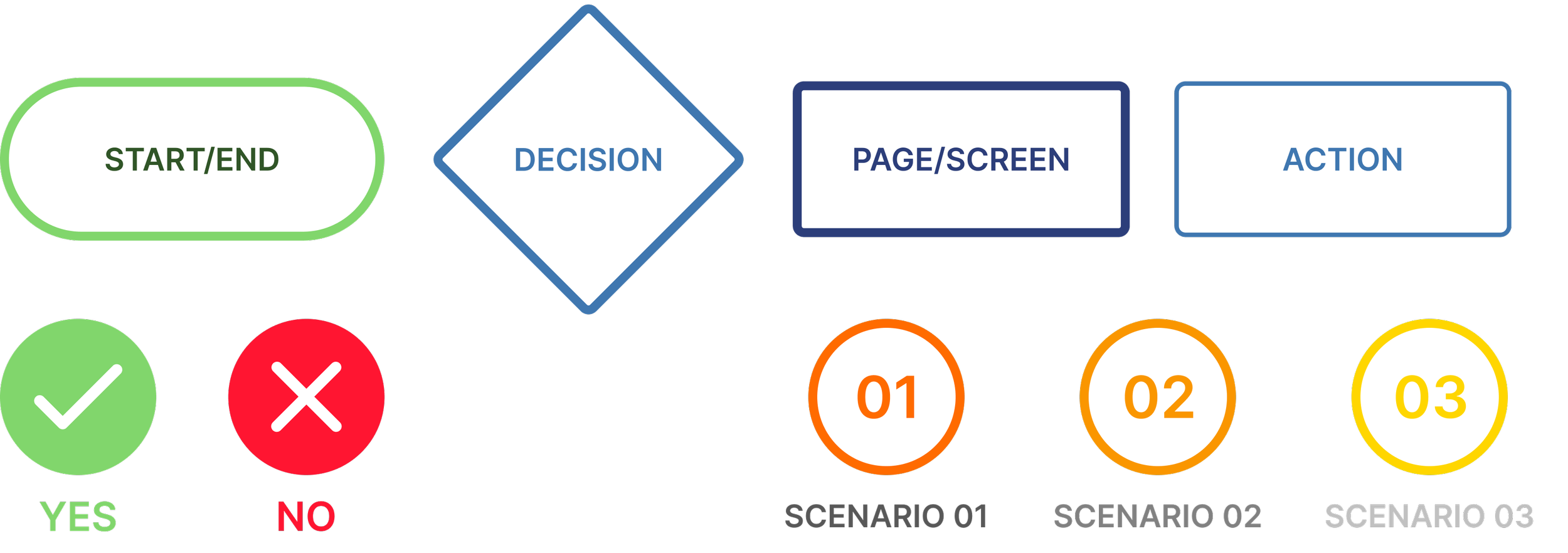
Legend
Scenario 01: Elena is visiting Near Here for the very first time and wants to be able to access all the features it provides, so as a first time user she needs to sign up and create her account.
Scenario 02: Elena got back from work and while her dinner is getting delivered she wants to get an update on what’s happening around her. She visits near here to learn about the owner of the week story as she enjoys knowing the story of who she’s buying from or supporting.
Scenario 03: Elena has a birthday dinner in the evening and she hasn’t had time to buy a gift. She quickly goes into her account and searches her saved favorites. She selects a couple stores near her dinner’s location and creates her walk of the day. Elena gets ready and goes on her adventure of finding a gift.
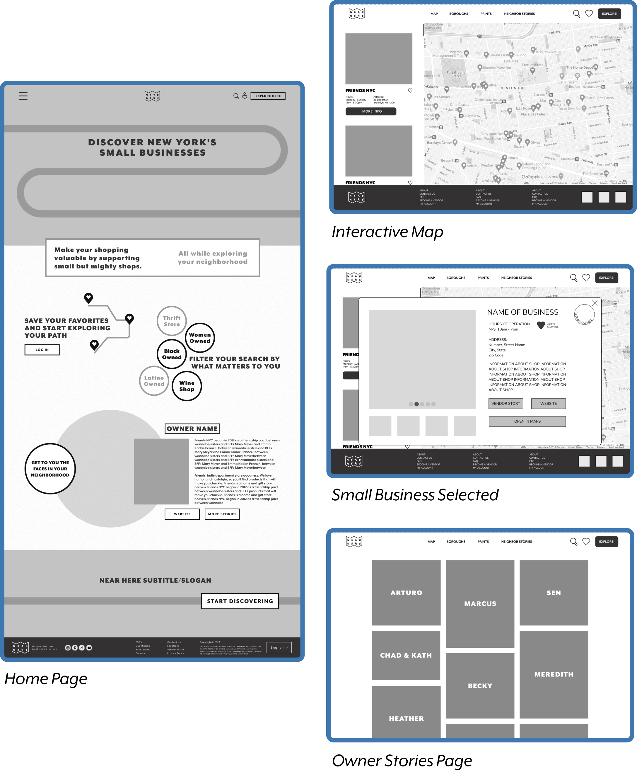
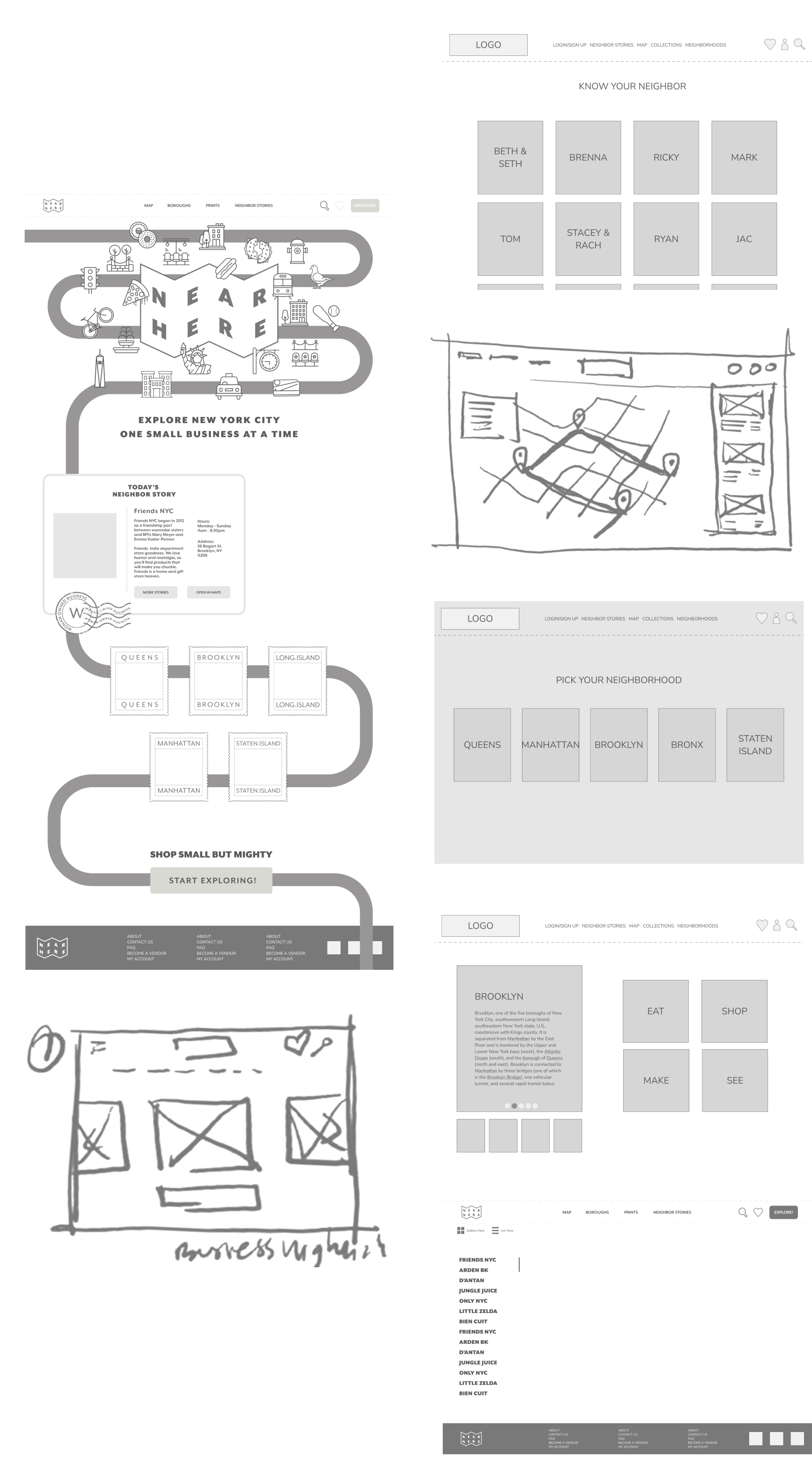
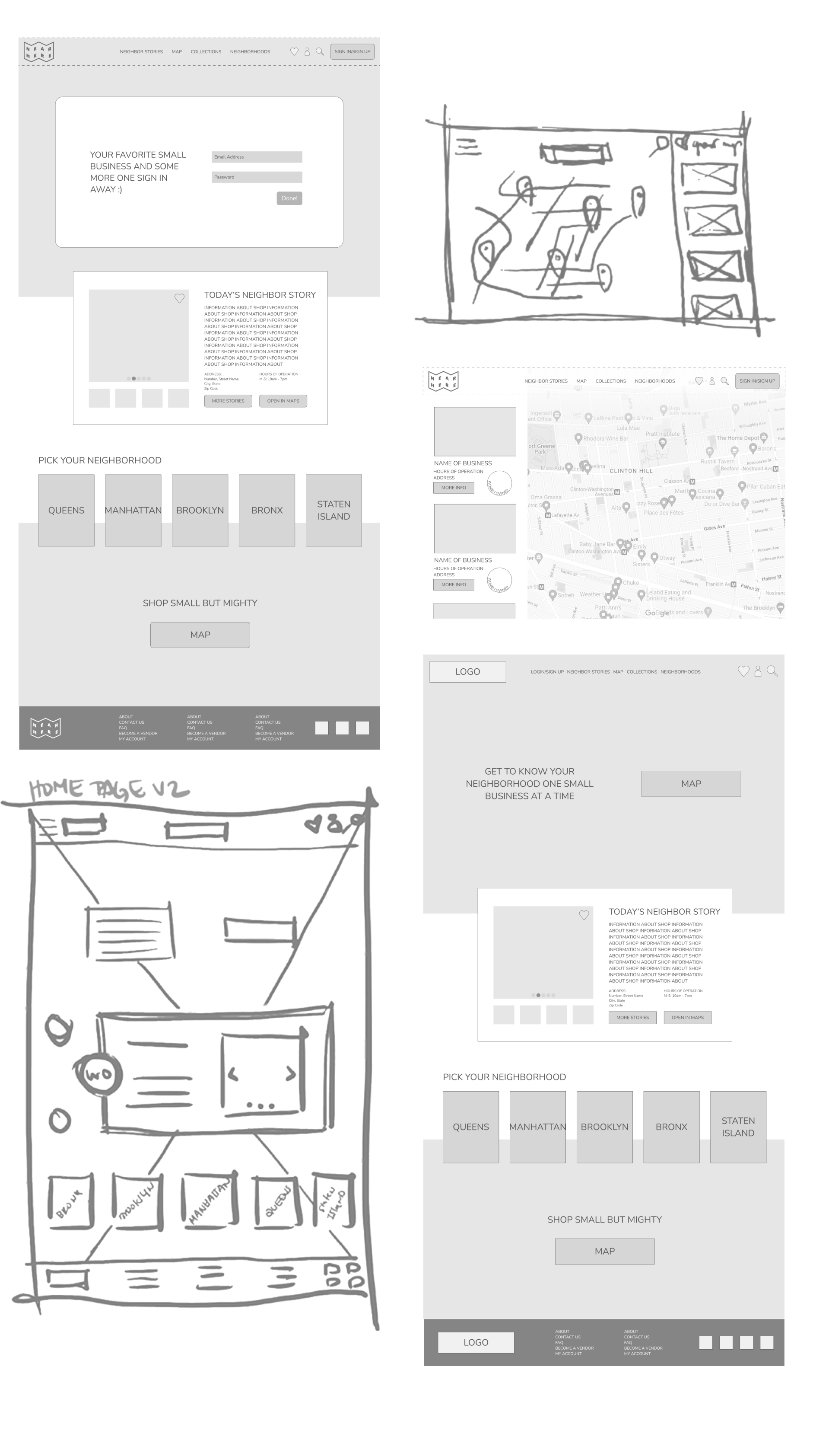
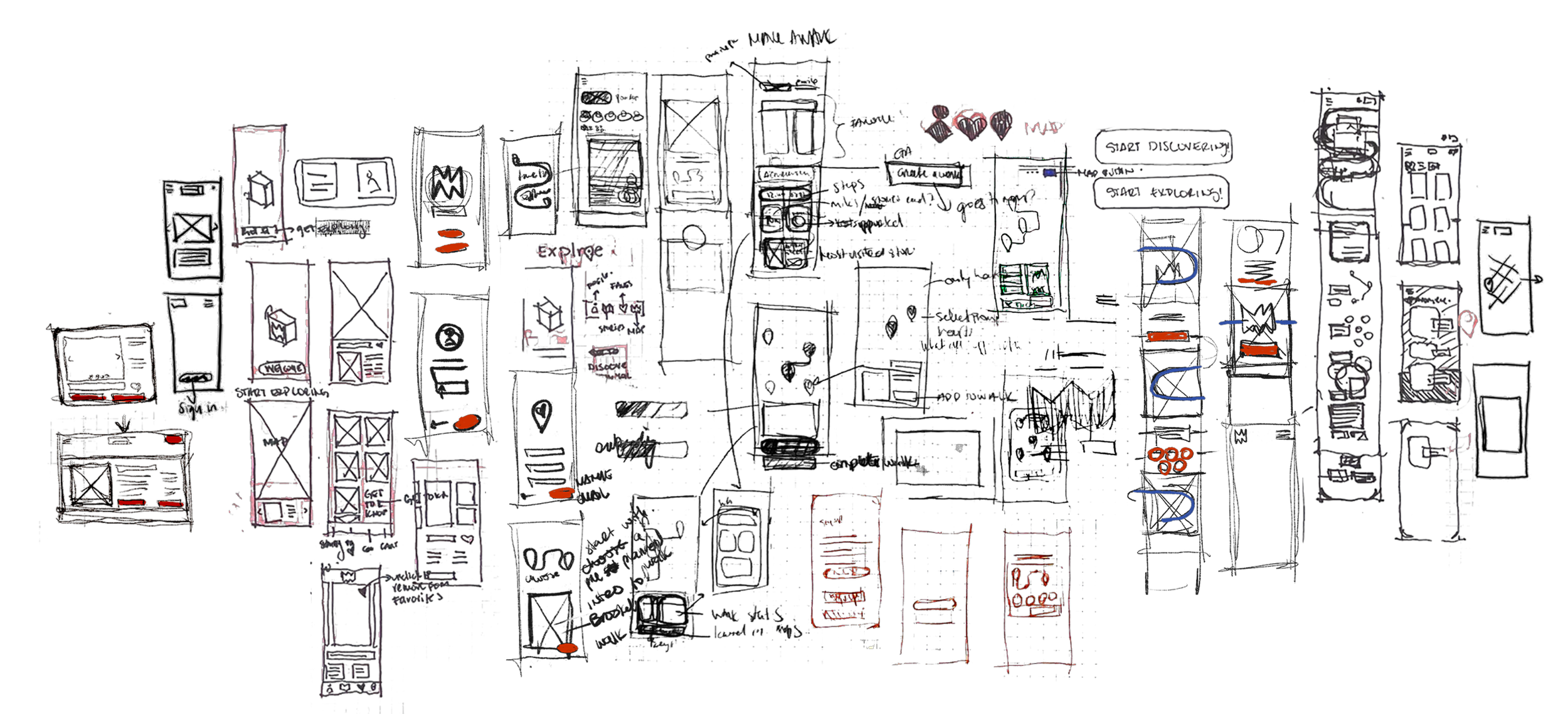
I began sketching what Elena’s user flow could start to look like and developed them into low fidelity wireframes for a web based resource. Through this identifying the priorities established throughout the research, like including an interactive map as the main way to see stores as well as featuring “today’s vendor story” that highlights the background of a vendor in NYC.
Pen to paper to low fidelity
Usability Testing
The low fidelity wireframes served as the base for preliminary prototype and usability testing. Here I was able to understand pain points of users as they navigated through this early design
One of the biggest takeaways was the disconnect of the preliminary design being web based. Near Here is supposed to get you out there and moving, so why doesn’t this do the same? Should Near Here be a mobile app?
What were the challenges?
This platform is meant to get you walking, how does this look on my phone?
Users took longer choosing where to do the first “click”/making that decision
Landing page information was successful in letting the user know the intent of Near Here.
What was enjoyed?
Overall concept is a refreshing take on exploring NYC
Enjoyed ability to save favorites. Need easier access
What information do I get when creating a profile? What does this look like?
I listened to the users, data points and decided to shift focus and develop Near Here as a mobile app. Recognizing this misalignment was an important step. The adjustment also positively reflects the original problem statement and our persona’s needs. So, how does this mobile app look and function?
Back on the drawing board
Once the key elements were defined I brought the sketches and wireframes into high fidelity designs. I developed key features in the app prioritizing:
1. How users interact with the map and store information
2. Access to profile & favorites
3. How users resonate with owner stories?
4. Being able to create a walk and see reward data.
High Fidelity Usability Testing
Once again taking the design to the users, I organized and conducted usability tests with a 7 people. Three in person and four over zoom and here are the key insights.
What did users say?
What were the challenges?
Information is cluttered, hard to read through especially the owner stories
Graphic elements can be distracting and take focus away from the main message
Wanted to interact with drop down menu, it could help easy accessibility to other pages.
What were the insights?
Platform gives a consistent and joyful feeling overall.
Being able to see owner or store values like if it’s woman owned is refreshing
Owner stories give a human touch to platform. it is a unique approach on how to “filter” through options
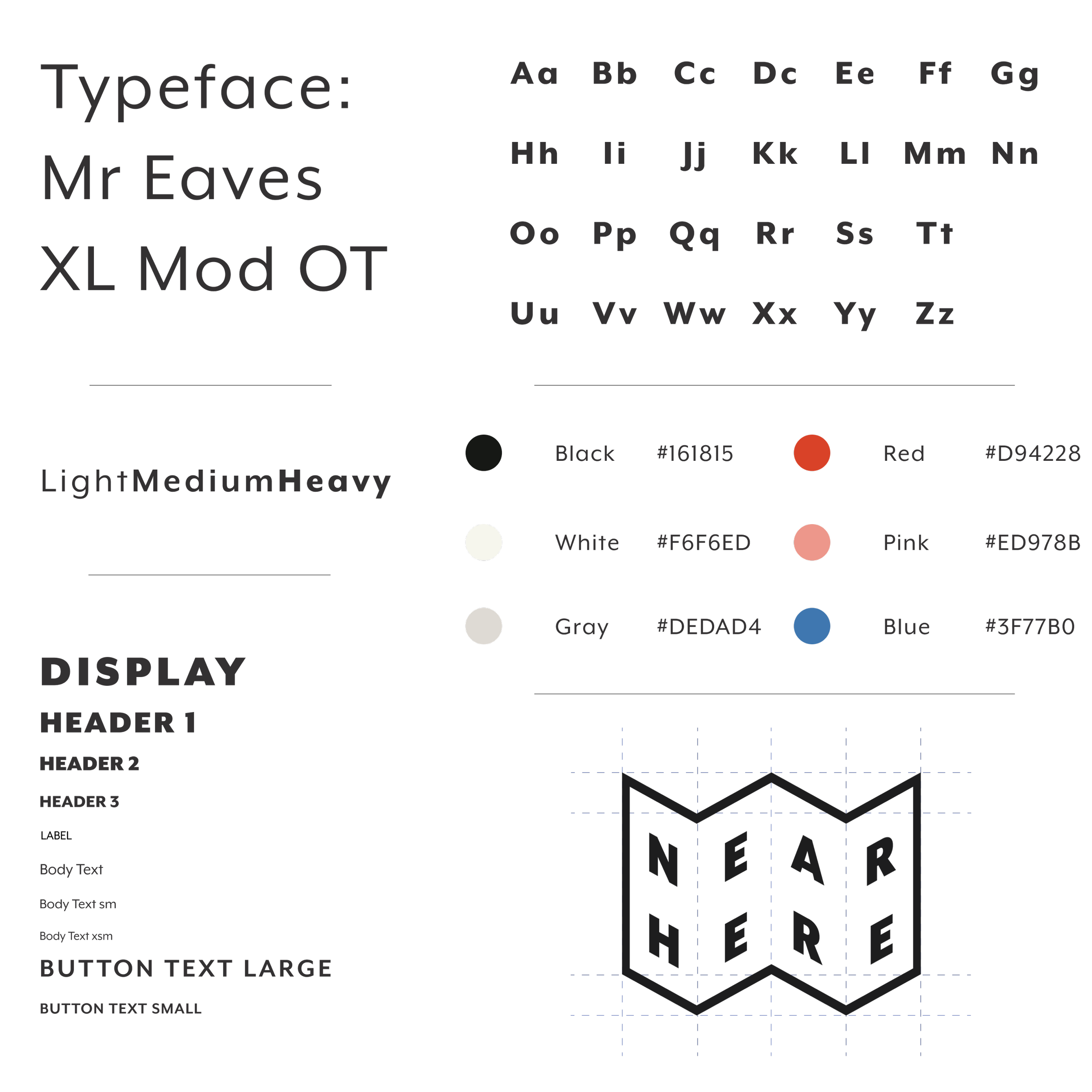
I refined Near Here’s style guide. After embracing the data and design revisions I wanted to polish the bases of the UI. I chose a typeface that was flexible and consistent and using user feedback to choose the colors. Ensuring the style guide benefits the user interactions rather than muddle as in the previous wireframe and prototype. The logo was designed based on a physical folding map, paying homage to how we used to get around.
Near Here’s Style
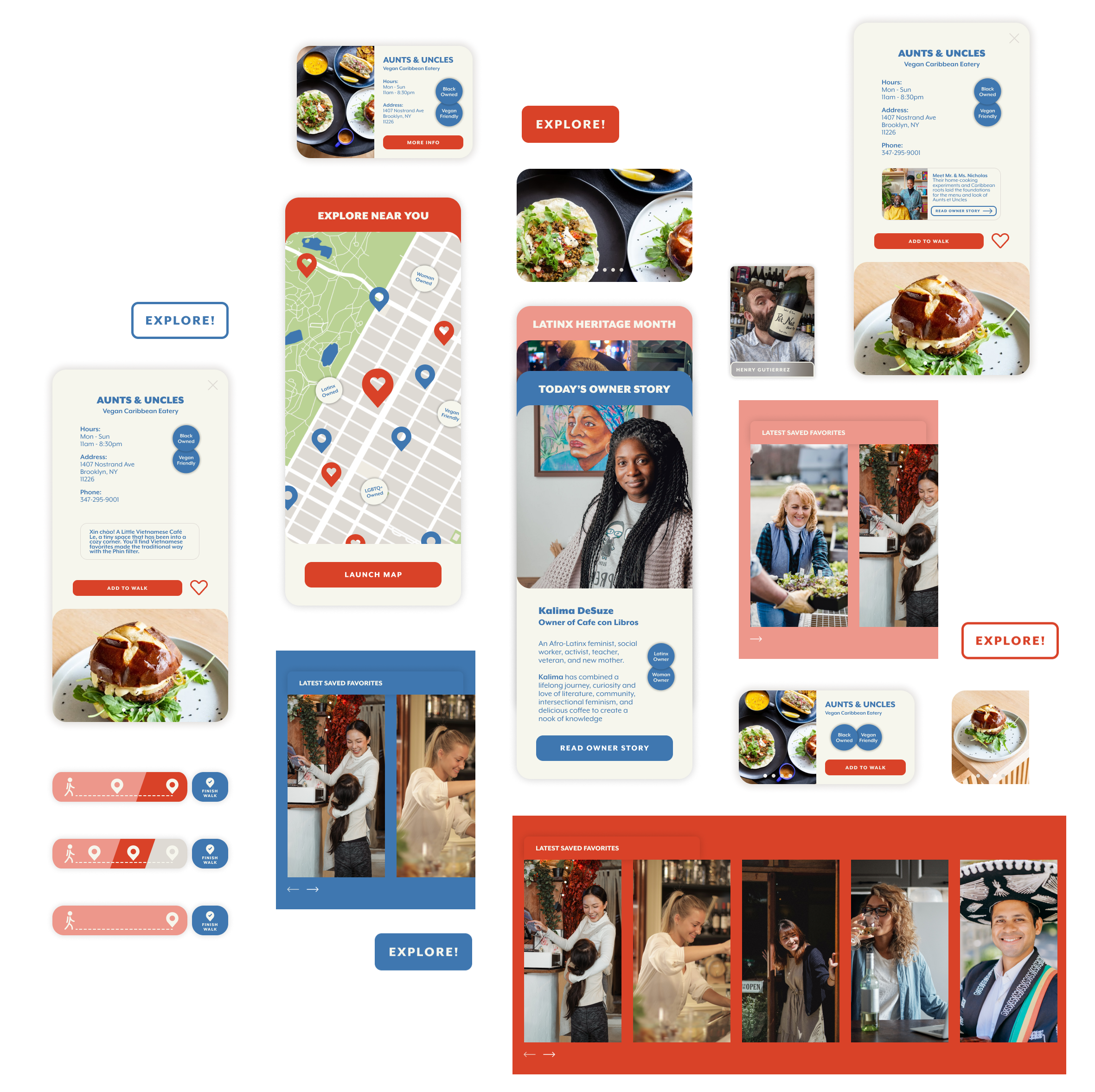
Continuing the UI kit, I refined the application’s components. Which serve as the building blocks or base ingredients to Near Here. The fine-tuning of over 30 components also helped in establishing hierarchy of elements throughout the design.
Components
Near Here
The latest design of Near Here is a consolidation of insights, feedback and user interaction that becomes an approach to addressing the problem statement.
I untangled previous user paint points through informed design decisions that clarify the core values and curiosity that near here provides.
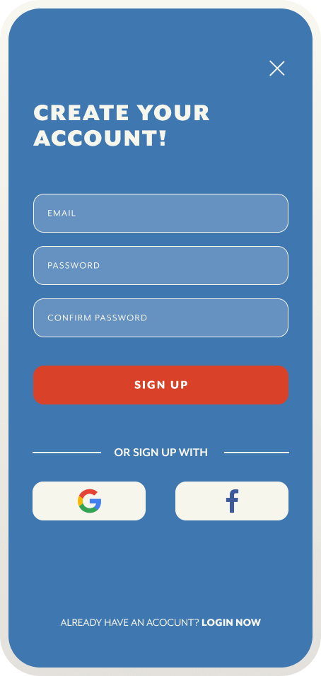
Sign Up & Explore Interactive Map
Near Here is…
A information resource focusing on NYC’s small businesses and it’s owners
Tracker of your achievements. The more you use Near Here & explore, the more you unlock
An interactive and playful space where you create walks you can share with friends
Supporter of small businesses and the faces behind it where you can find your next hot spot
A place that layers a unique yet needed way to filter through where you visit next
Embraces holidays and diversity through curated walks and featured content
Platform that gives owners a platform to share the voice and stories
Flexible and caters to different explorers or shoppers needs
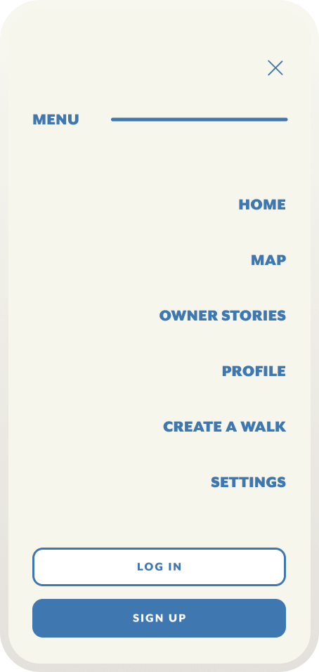
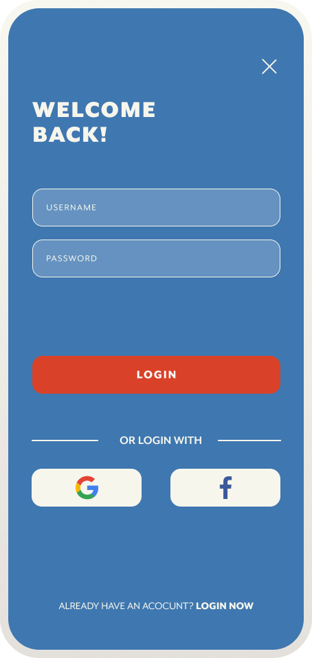
The drop down menu facilitates user’s access to key features as well as how you login or sign up.
Sign Up or Welcome Back!
SignUp Screen
Dropdown Menu Overlay
LogIn Screen
Onboarding
Hi, you’re a first timer? Not to worry. The onboarding sequence is a brief tour of what you get as new user of Near Here
Get to Know Your Neighbors
I wanted to provide a space for the face behind the counter. In the home page user’s are able to engage with a highlighted owner story of the day where they can learn about their personal and professional stories. Want more? Go to the owner stories screen and pick who you want to know next
Home Screen | Owner Story of the Day Section
Owner Stories
Create a Walk
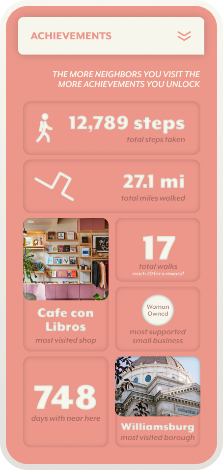
Giving your favorites a playful remake. I wanted users to not only be able to create a walk they can go on along or share with friends but also see the impact of these walks. How many women owned businesses you’ve visited? How many walks have you done? How owners you’ve gotten to know? You get to see how much you’ve achieved as a Near Here user.
Create a Walk
Naomi’s Earned Rewards & Achievements
Create a Walk | Starting Point: Profile
Create a Walk | Starting Point: Drop Down Menu
In a place like New York City, where there is so much to be celebrated the smaller players tend to be hidden behind the glitz of big box brands.
Through the research there was a clear cherishing for experiences that have a layer or meaning and social importance, so why should discovering NYC not reflect that?
I can see Near Here be applicable to many melting pot cities like London or Berlin. Perhaps being able to collaborate with museums or influencers to create bespoke walks or lists. Near Here can start with giving New York’s small businesses a platform but that is only the start.
