Desktop and mobile design for concept travel website Wayfarer. A place for travelers to discover new locations and information to visit around the world.
Wayfarer is a concept website that merges your favorite travel blogs, magazines, Pinterest boards and saved instagram posts into one refines website. Where you can explore destinations without the repetitive pop ups trying to get you to book with them. Whether you want to simply learn about a destination or use it as your first top of your future travel itinerary, wayfarer is a playful tool for your adventures.
Travel research hub
Though physical travel tickets are now less common. Wayfarer’s logo is inspired by this familiar first step in your day of travel and Wayfarer is simply that…you first step. Your ticket is the gateway to new experiences and so is this platform. The logo is designed to be flexible from device to device, or printable formats. This way remaining recognizable whether you’re visiting on your phone or your promotional mail (that comes in the shape of a physical ticket perhaps?)
Scalable Branding
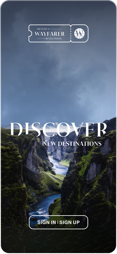
Using the fundamentals of storytelling and UX Writing, the intent was to have the written words of the landing page be brief but powerful in the message being conveyed. The landing page begin and ends with the core ideas of Wayfarer: Discover new destinations & Adventure Awaits.
Once a narrative was built while developing the sketch wireframes the low fidelity wireframes started to take shape. Each iterations building upon the strengths of the previous and each providing a learning moment of editing and recognizing what could be improved upon.
The wireframes were designed to build the architecture of the app and to analyze the hierarchy of the content that needed to be displayed.
Journey to high fidelity
wireframe progress sequence
Travel is about movement and through it expanding your world. Wayfarer’s landing page takes a similar approach. The way you interact with the elements of the website merge playful movement with the information you are being provided with. This, with the core intent of keeping the user engaged throughout the use of the website.
Adventure Awaits
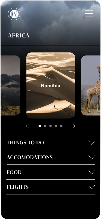
While exploring you are on the go, and Wayfarer’s website should be adaptable to this. Through the mobile interface I was able to continue developing how you can interact with a new destination. I simplified the world into a circular tour of the continents. This served as the top of the information hierarchy: Continent to Country to City.
Scalable Design
Country Page
Launch Screen
Explore the Continents


